

MyType is an innovative dating app that allows users to precisely define their preferences, including physical attributes. Its algorithm is expertly calibrated to align with these specific criteria, providing a tailored and more relevant selection of potential matches.
This approach not only enhances user satisfaction but also increases the efficiency of the matchmaking process, making it a game-changer in the online dating landscape.
Uncovering the extent of the issue
Research
To gain a more comprehensive insight into the issue and understand its full extent, I turned to statistical research data for a deeper analysis.

Role
Research, UX/UI Design
Tools
Figma
Duration
10 weeks
The problem
Dating apps lead to emotional burnout
Dating apps can lead to emotional burnout due to the overwhelming number of choices they present, which often leads to indecision and anxiety.
Additionally, the frequent cycle of rejection and superficial interactions based on limited information can negatively affect self-esteem.
This combination of relentless choice, shallow connections, and the pursuit of unfulfilled expectations can result in users feeling disillusioned and emotionally drained, as they navigate through an often fruitless search for meaningful relationships.


What I think
Assumptions
Assumption 1:
Individuals grow weary of dating apps due to the multitude of unqualified profiles they have to sift through
Assumption 2:
The effectiveness of dating apps falls short due to the lack of comprehensive filters to narrow down preferences
Assumption 3:
Despite the wide range of options on dating apps, their generic algorithms often fail to match users accurately, resulting in wasted time and frustration. This shortfall in meeting preferences prompts many users to abandon these platforms.
Affinity mapping
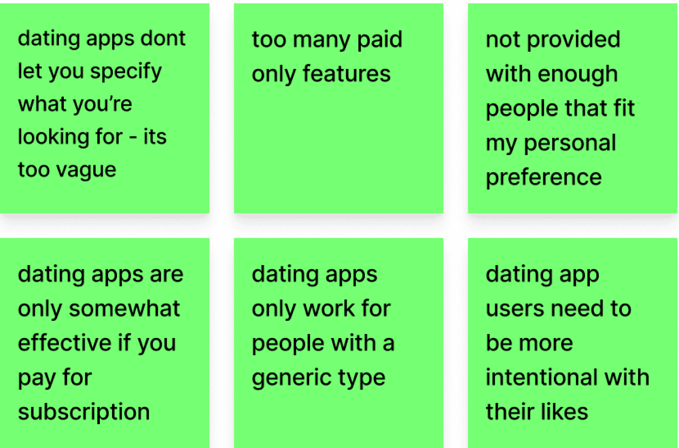
Affinity mapping is a key technique for organising data into meaningful themes: pain points, motivations, and behaviours.
It helps identify user challenges, driving forces, and interaction patterns.
This method is invaluable for transforming complex data into clear, actionable insights, enabling user-centred and effective design solutions.
Pain points:

Motivations:


Behaviours:


What do users say?
Interviews
I've enlisted four participants for my interviews, comprising two males and two females. These recruited participants hold distinct dating objectives when using a dating app, providing a diverse perspective and unbiased views for my research.
Participant 1:
Male
29
Meet new people
“Dating apps are only good for hookups”
Participant 2:
Female
24
Find a life partner
“Feels like a game of hot or not with no intention to pursue anything”
Participant 3:
Female
23
Meet new people, see where it goes
“It’s so hard to find someone with same intentions as me”
Participant 4:
Male
21
Find a short term partner
“There is no much option, feels disposable”

Persona
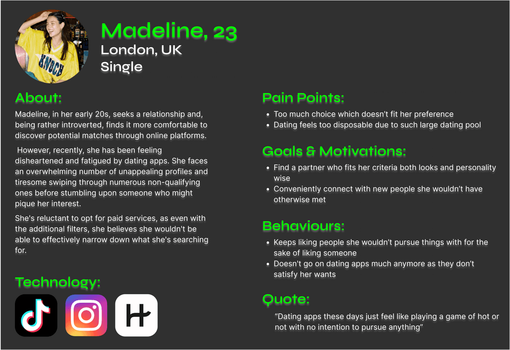
To foster empathy with the user, I developed a persona named Madeline. This aids in concentrating our efforts on specific individuals for the next phases of the design process.
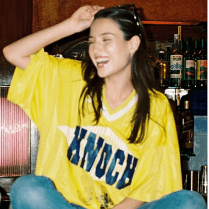

Madeline, 23
London, UK
Single
About:
Madeline, in her early 20s, seeks a relationship and, being rather introverted, finds it more comfortable to discover potential matches through online platforms.
However, recently, she has been feeling disheartened and fatigued by dating apps. She faces an overwhelming number of unappealing profiles and tiresome swiping through numerous non-qualifying ones before stumbling upon someone who might pique her interest.
She's reluctant to opt for paid services, as even with the additional filters, she believes she wouldn't be able to effectively narrow down what she's searching for.
Pain Points:
Too much choice which doesn’t fit her preference
Dating feels too disposable due to such large dating pool
Goals & Motivations:
Find a partner who fits her criteria both looks and personality wise
Conveniently connect with new people she wouldn’t have otherwise met
Behaviours:
Keeps liking people she wouldn’t pursue things with for the sake of liking someone
Doesn't go on dating apps much anymore as they don’t satisfy her wants
Quote:
“Dating apps these days just feel like playing a game of hot or not with no intention to pursue anything”
Technology:



Grouping insights into themes
Themes
I have categorised my user insights into themes because it streamlines the data, making it easier to identify recurring patterns and trends.
Apps pushing users towards subscription for revenue
Many crucial features are exclusively accessible to subscription users, as apps emphasise pushing users toward paid subscriptions to prioritise revenue over user accessibility and goal-oriented service.
Users download dating apps for misguided purposes/time-wasting interactions
Numerous challenges within dating apps stem from user behaviour.
Many individuals download these apps with misguided intentions such as seeking validation through likes, engaging in superficial judgment, or with no genuine intention of meeting in person.
Consequently, this results in considerable time wastage as such profiles do not align with the preferences of genuine users.
Lack of sufficient personalisation
The ultimate theme among interviewees was the absence of personalisation. This is substantiated by Theme 1, where free services fail to enable users to precisely specify their preferences. Even with a subscription, the filters remain somewhat ambiguous.
Because of the absence of suitable profiles provided to users, they are motivated to perpetuate problematic user behaviour, mentioned in Theme 2, by liking profiles that don't align with their criteria simply because they are the best options among a set of other non-qualifying profiles presented to them
Role
Research, UX/UI Design
Tools
Figma
Duration
10 weeks
The problem
Dating apps lead to emotional burnout
Dating apps can lead to emotional burnout due to the overwhelming number of choices they present, which often leads to indecision and anxiety.
Additionally, the frequent cycle of rejection and superficial interactions based on limited information can negatively affect self-esteem.
This combination of relentless choice, shallow connections, and the pursuit of unfulfilled expectations can result in users feeling disillusioned and emotionally drained, as they navigate through an often fruitless search for meaningful relationships.

Uncovering the extent of the issue
Research
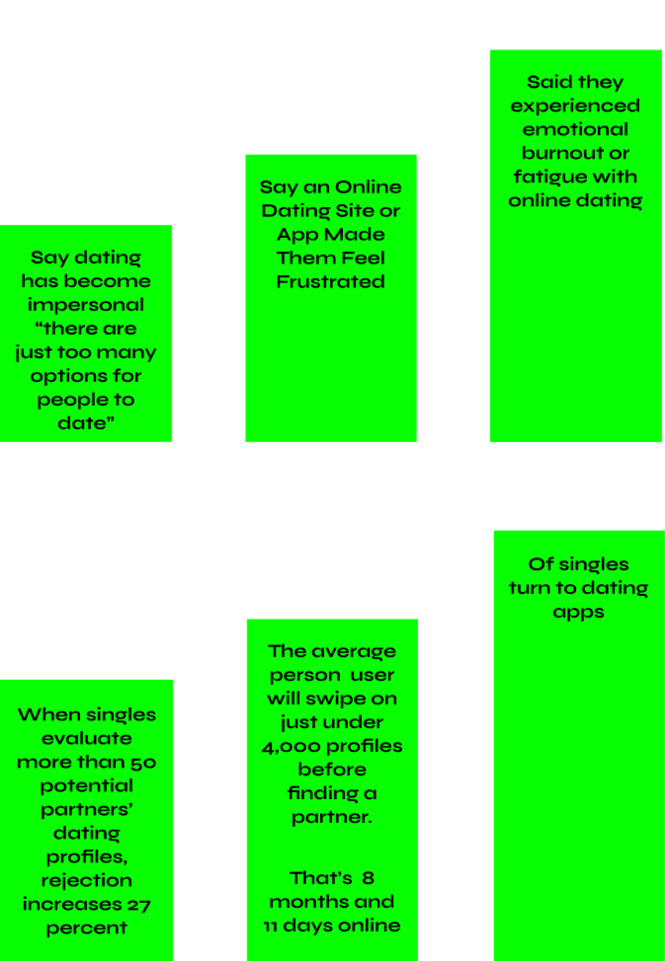
To gain a more comprehensive insight into the issue and understand its full extent, I turned to statistical research data for a deeper analysis.
1/3

Of singles turn to dating apps
20%

Say dating has become impersonal “there are just too many options for people to date”
45%

Say an Online Dating Site or App Made Them Feel Frustrated
80%

Said they experienced emotional burnout or fatigue with online dating
4,000
The average person user will swipe on just under 4,000 profiles before finding a partner.
That’s 8 months and 11 days online
>50
When singles evaluate more than 50 potential partners’ dating profiles, rejection increases 27 percent
What I think
Assumptions
Assumption 1:
Individuals grow weary of dating apps due to the multitude of unqualified profiles they have to sift through
Assumption 2:
The effectiveness of dating apps falls short due to the lack of comprehensive filters to narrow down preferences
Assumption 3:
Despite the wide range of options on dating apps, their generic algorithms often fail to match users accurately, resulting in wasted time and frustration. This shortfall in meeting preferences prompts many users to abandon these platforms.
Affinity mapping
Affinity mapping is a key technique for organising data into meaningful themes: pain points, motivations, and behaviours.
It helps identify user challenges, driving forces, and interaction patterns.
This method is invaluable for transforming complex data into clear, actionable insights, enabling user-centred and effective design solutions.
Pain points

Motivations

Behaviours

What do users say?
Interviews
I've enlisted four participants for my interviews, comprising two males and two females. These recruited participants hold distinct dating objectives when using a dating app, providing a diverse perspective and unbiased views for my research.
Participant 1:
Male
29
Meet new people
“Dating apps are only good for hookups”
Participant 2:
Female
24
Find a life partner
“Feels like a game of hot or not with no intention to pursue anything”
Participant 3:
Male
21
Find a short term partner
“There is no much option, feels disposable”
Participant 4:
Female
23
Meet new people, see where it goes
“It’s so hard to find someone with same intentions as me”
Grouping insights into themes
Themes
I have categorised my user insights into themes because it streamlines the data, making it easier to identify recurring patterns and trends.
I have categorised my user insights into themes because it streamlines the data, making it easier to identify recurring patterns and trends.
Apps pushing users towards subscription for revenue
Users download dating apps for misguided purposes/time-wasting interactions
Lack of sufficient personalisation
Many crucial features are exclusively accessible to subscription users, as apps emphasise pushing users toward paid subscriptions to prioritise revenue over user accessibility and goal-oriented service.
Numerous challenges within dating apps stem from user behaviour.
Many individuals download these apps with misguided intentions such as seeking validation through likes, engaging in superficial judgment, or with no genuine intention of meeting in person.
Consequently, this results in considerable time wastage as such profiles do not align with the preferences of genuine users.
The ultimate theme among interviewees was the absence of personalisation. This is substantiated by Theme 1, where free services fail to enable users to precisely specify their preferences. Even with a subscription, the filters remain somewhat ambiguous.
Because of the absence of suitable profiles provided to users, they are motivated to perpetuate problematic user behaviour, mentioned in Theme 2, by liking profiles that don't align with their criteria simply because they are the best options among a set of other non-qualifying profiles presented to them
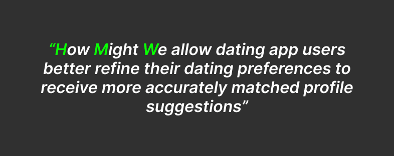
“How Might We allow dating app users better refine their dating preferences to receive more accurately matched profile suggestions”
Persona
To foster empathy with the user, I developed a persona named Madeline. This aids in concentrating our efforts on specific individuals for the next phases of the design process.
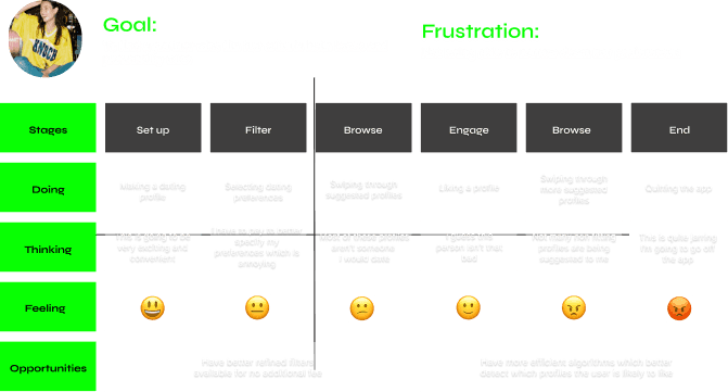
Current dating app experience
Experience mapping
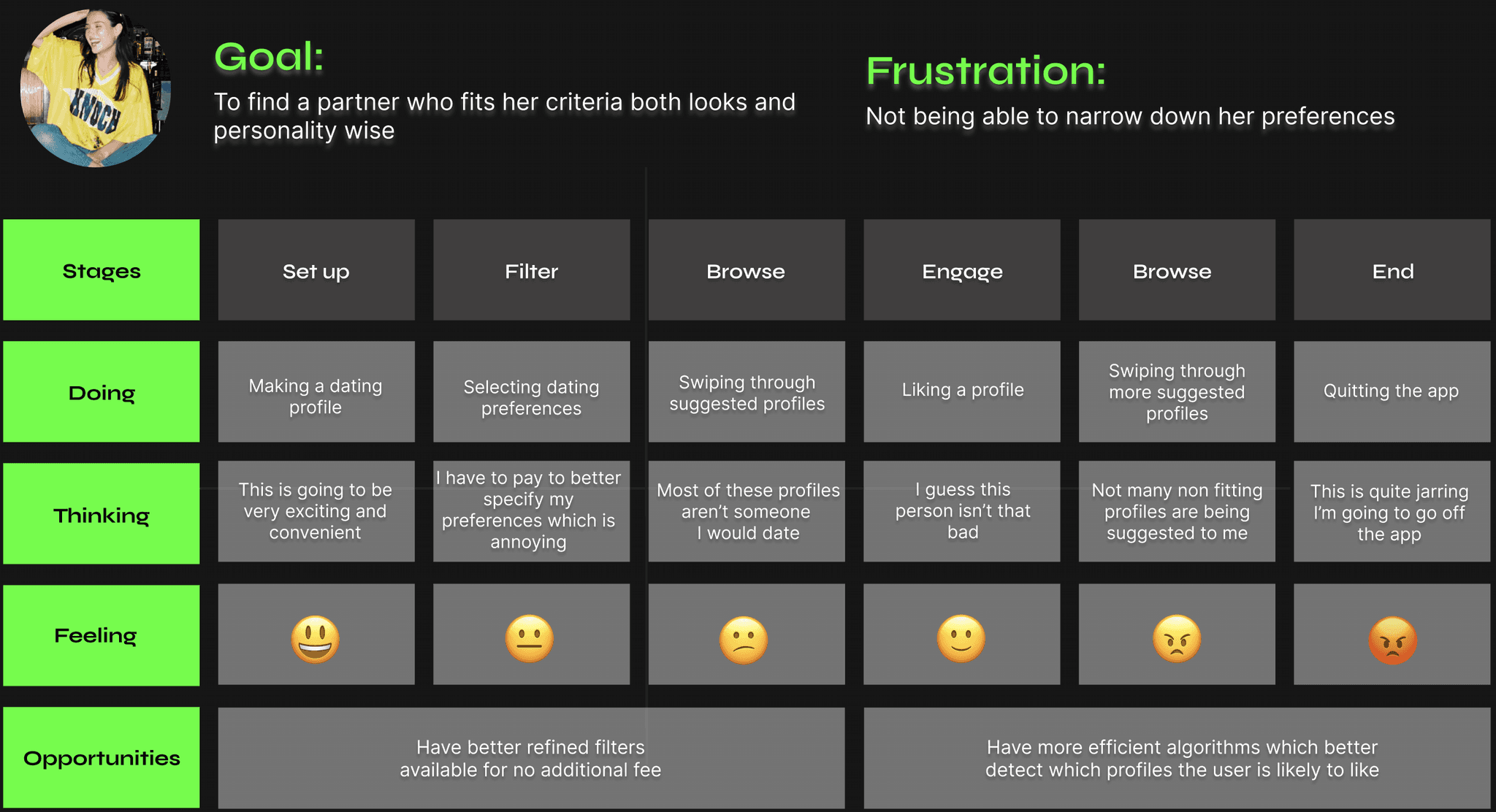
Experience mapping in UX is the process of visually depicting a user's journey with a product or service.
It's invaluable because it provides insights into user emotions, needs, and interactions, helping designers identify areas for improvement and create user-centric solutions.
To better align my product with user needs and discover potential solutions, I created an experience map.
To spot opportunities for improvement, I visualised Madeline's current online dating experience.
App functionality
Task flows
After the ideation phase and crafting user stories, I pinpointed the crucial functionalities for the app.
I've developed a step-by-step sequence illustrating how users can perform two key tasks within my app: setting up their account and preferences, and initiating a match and conversation.
This sequence offers a visual representation of user interactions and system responses throughout these processes.

Setting up account
Primary task flow
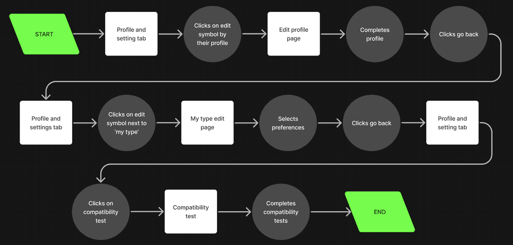
Logging in and creating an account is a standard and necessary step in most apps. However, in my task flow, I've chosen to bypass this initial step to focus on the app's functionality once the user is logged in, where the exciting part begins.
After the user verifies their email, uploads identification, and gets approved, they are directed to their profile. In this specific scenario, let's take Madeline as an example. Madeline proceeds to enhance her profile by adding photos and sharing more about herself. Once her profile is complete, she fine-tunes her preferences, specifying precisely what she's looking for and expecting from the app.
To help the algorithms better understand her compatibility preferences, she decides to engage in the fun and interactive Compatibility tests available within her profile.
Matching & sending a message
Secondary task flow

Interacting with other user profiles on the app is a fundamental action for all users. I've illustrated this process in the secondary task flow,
In this flow, you can observe Madeline as she browses through the suggested profiles. As she indicates her interest by either accepting or declining them, the algorithm becomes better at understanding her preferences and presenting more accurate matching profiles.
When Madeline encounters a user profile that piques her interest and results in a mutual like, she proceeds to the "It's a Match" page. At this point, Madeline takes the initiative to send the first message. However, unsure of what to say, she explores the suggested message prompts to help her break the ice and initiate a conversation.
Brainstorming solutions
Sketches
While I initiated the process of sketching potential design solutions, I maintained a strong focus on the persona and her anticipated user journey. Empathising with Madeline, I ensured that my sketches aimed to effectively address her pain points and provide solutions through the proposed designs.
Creating an account
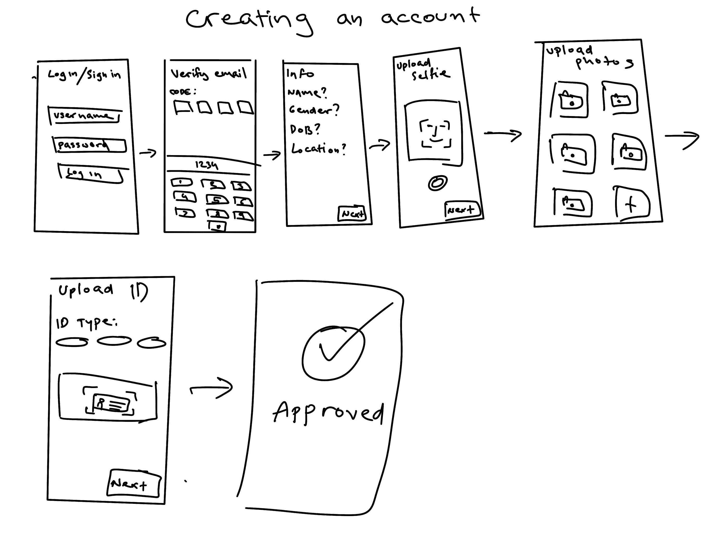
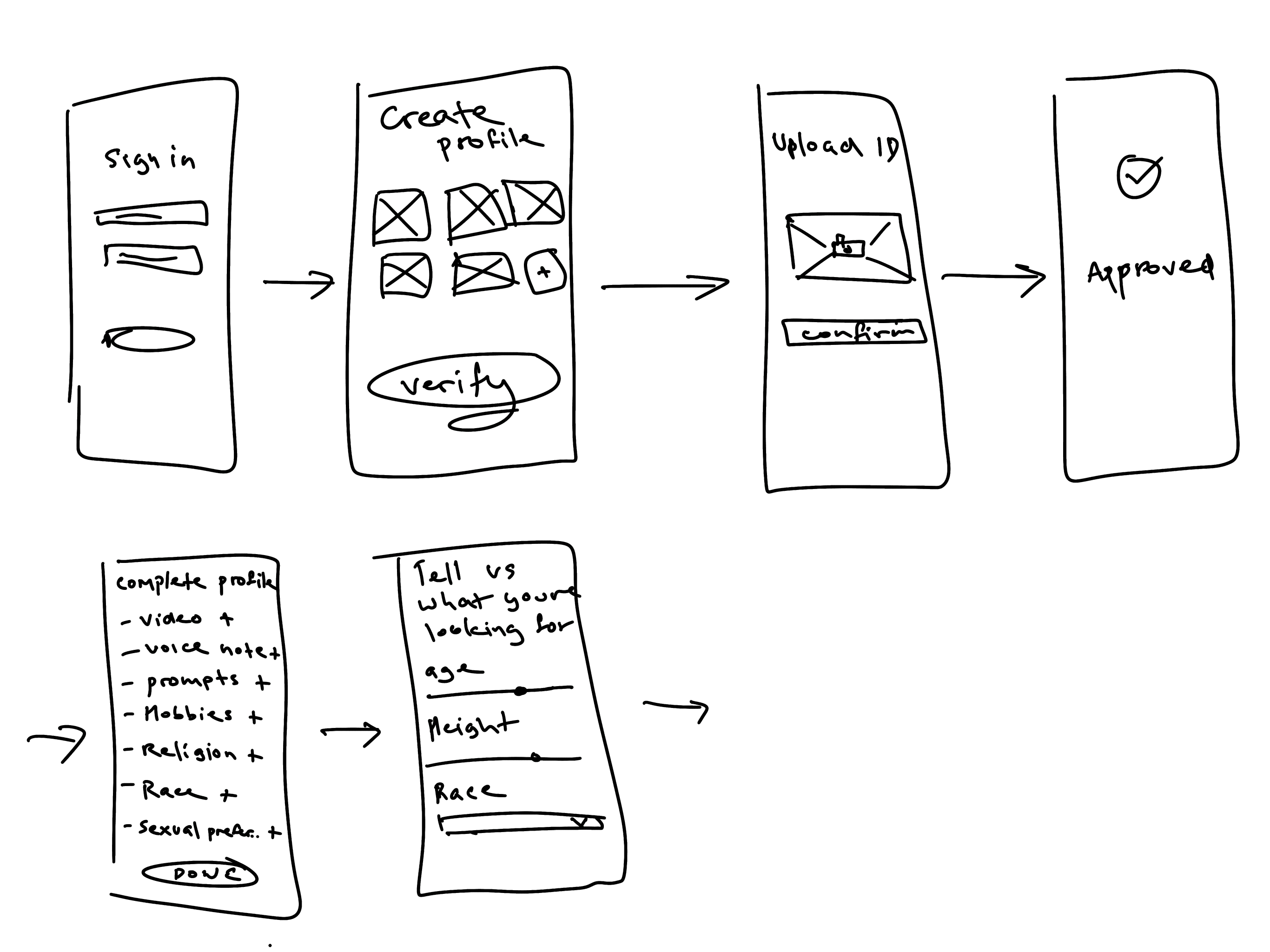
While developing the sign-up process, I placed significant emphasis on profile authentication to ensure the authenticity of all users on the dating app. To achieve this, I integrated ID verification into the process, ensuring that profile names and ages align with the actual information. Additionally, users are required to upload a selfie as an extra measure to prevent impersonation.
Our users highly value the assurance that everyone they encounter on our app is a genuine profile. While I recognize that this verification process can be a bit time-consuming, I want to emphasize that it's a one-time requirement during account creation. This approach ensures a safer and more trustworthy environment for all users.
Footer
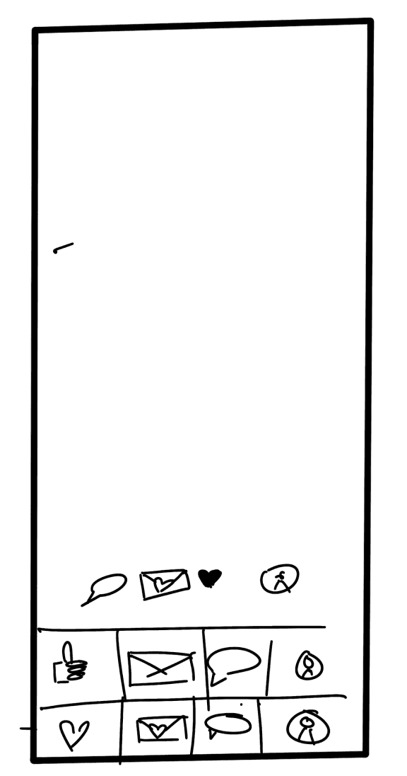
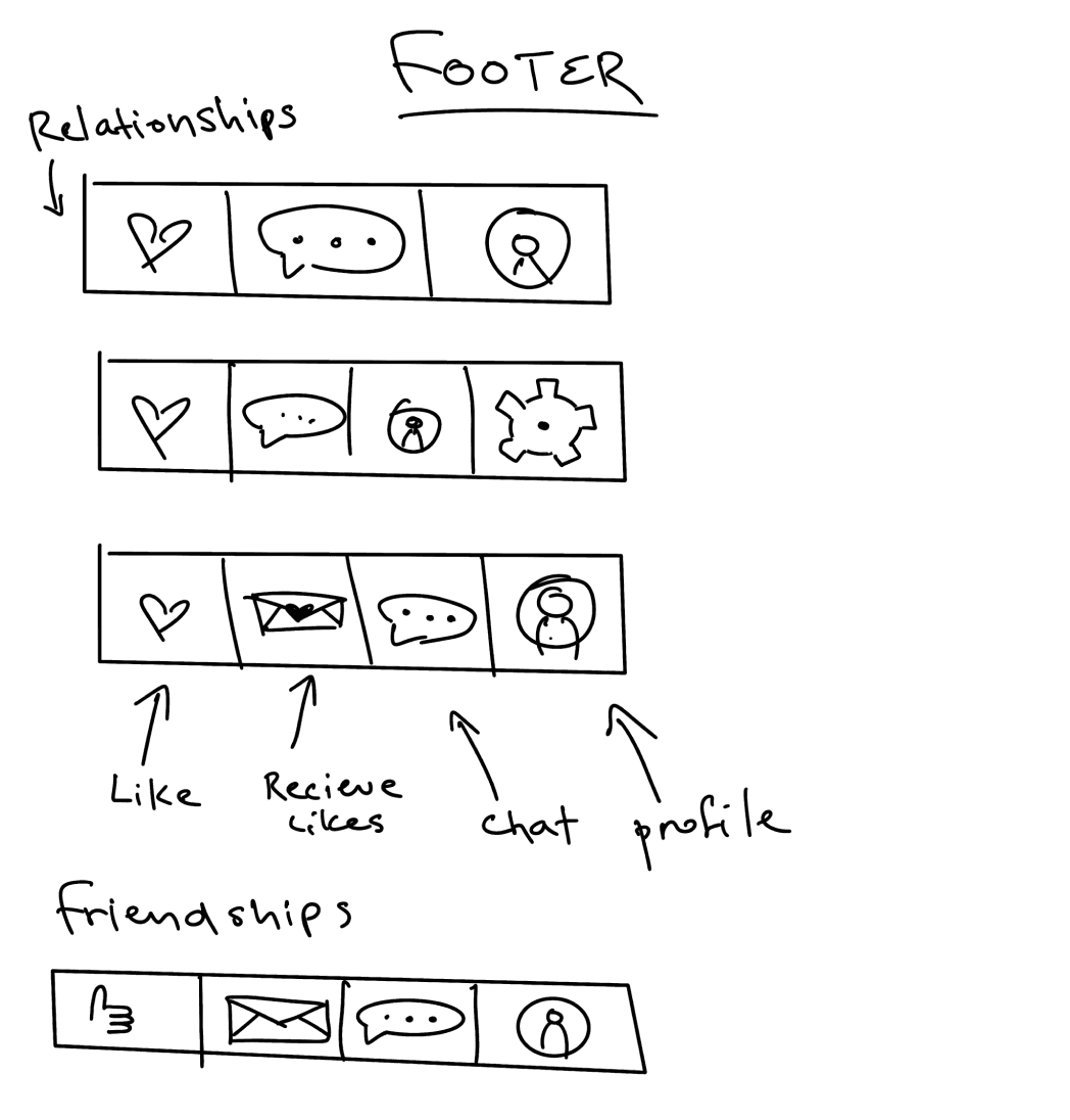
In the footer design, I experimented with various tab orders and conducted user testing with my peers to determine the most user-friendly layout. Additionally, I prepared a different footer variation for a potential "Friendship Finder" version of the app, which is a feature I plan to develop in the future. This approach ensures that the footer is intuitive for current users while being adaptable for future enhancements.
Profile
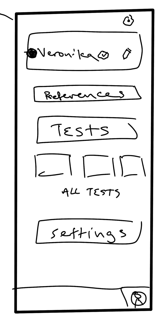
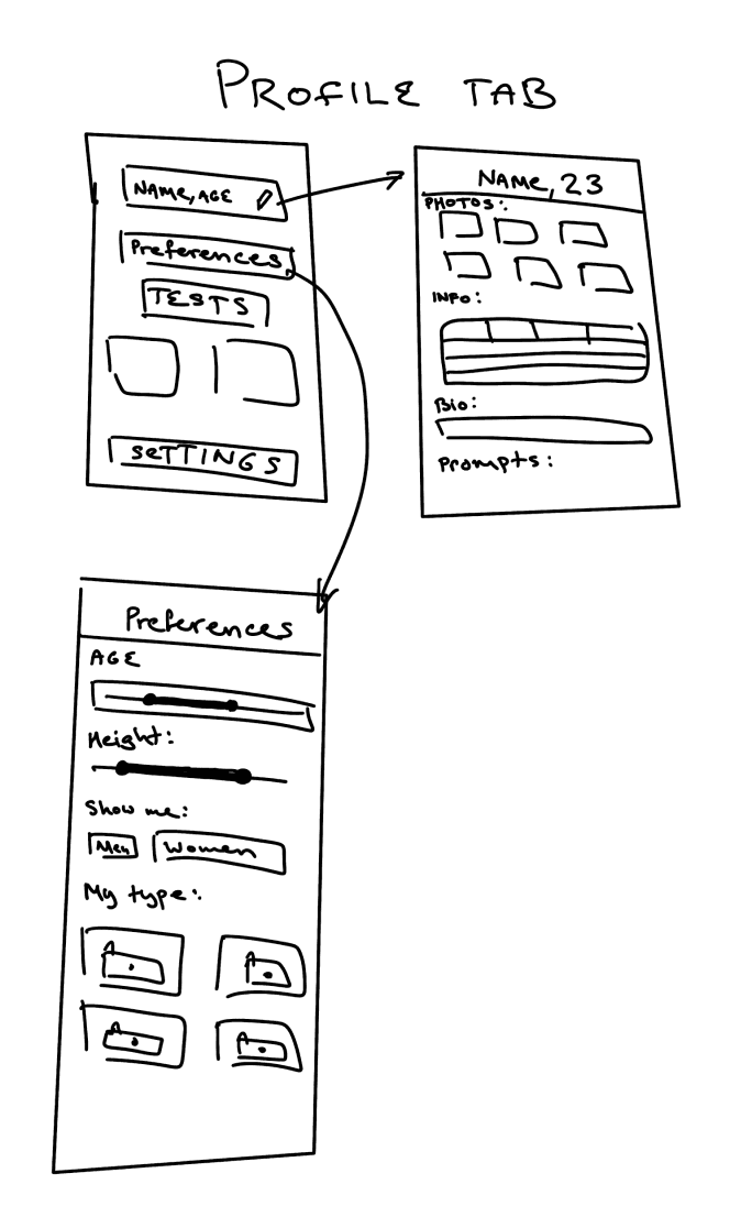
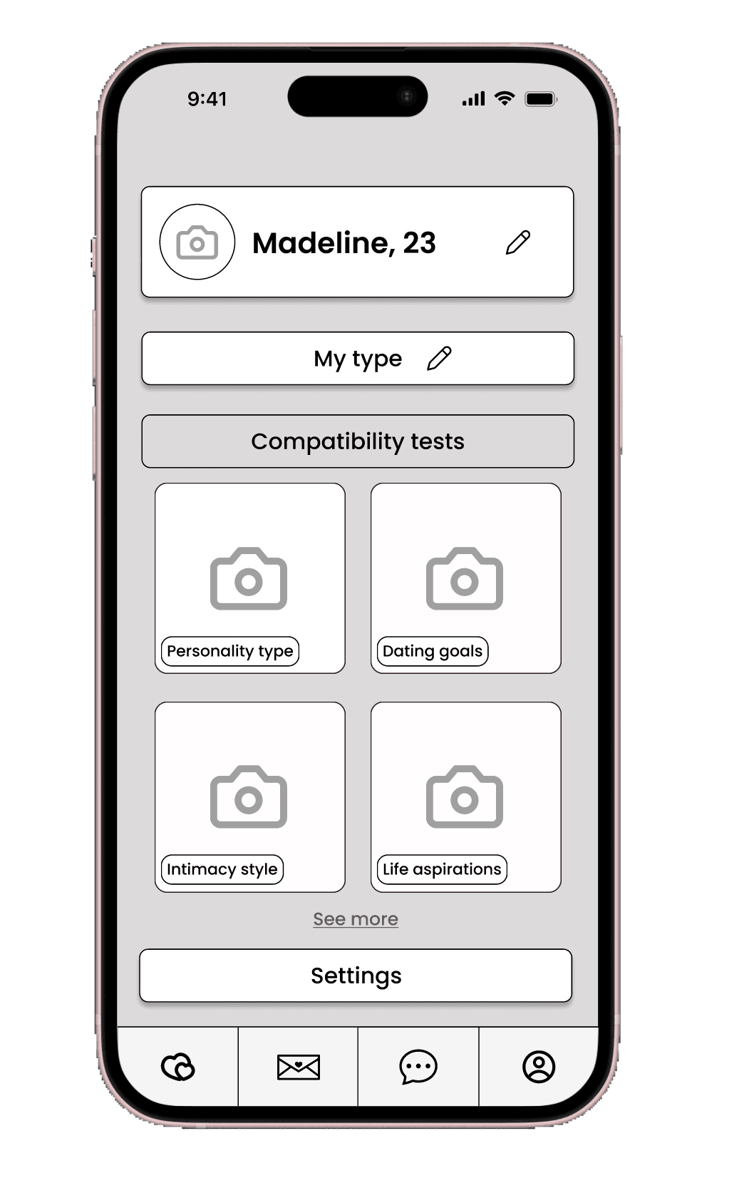
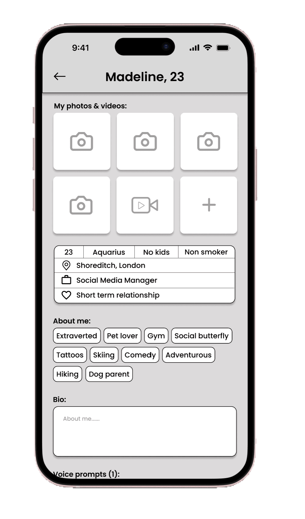
When designing the profile tab, I drew inspiration from several competitors and incorporated my favourite features into it. The profile tab prominently features edit profile and edit preferences options, which seamlessly redirect users to dedicated pages for making changes.
Beneath these options, I introduced compatibility quizzes that serve a dual purpose. Firstly, they provide a fun and interactive element to engage users. Secondly, they offer valuable insights into each user's preferences and behaviours, allowing us to present more compatible profiles. These quizzes are mandatory, and the compatibility percentage displayed on each profile is based on the results.
In addition to the mandatory quizzes, there is also an extensive selection of optional quizzes available to users. These quizzes further enhance our understanding of their preferences, helping us refine the matching process to meet their specific criteria and desires.
Chat

In designing the chat page, I've prioritised aligning with users' expectations for the layout. I've also ensured that when messaging, users have the freedom to express themselves fully. This includes the ability to send photos, videos, voice notes, and GIFs, as well as play virtual games like 8 ball pool and darts within the chat.
These features are aimed at helping users break the ice and engage in more interactive conversations. Additionally, I've implemented expiring conversations as a valuable element. This ensures that users are intentional in their matches and conversations. If users haven't been in contact for over a month, whether they've exchanged numbers or lost interest, the conversations will expire and be removed.
Likes
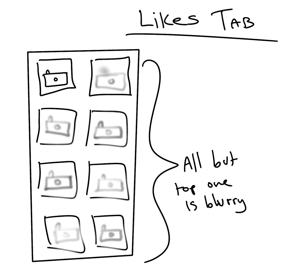
On the "Like" page, I've implemented an expiring element to discourage users from accumulating likes and to encourage activity on the app. To ensure fairness, I've arranged likes with the most recent ones appearing at the bottom, following a first-come-first-serve principle. Only the top like is displayed clearly, while the others remain blurred. Users must either match or decline the top profile to unblur the next one.
To maintain a dynamic environment, profiles that users don't interact with within a week will eventually disappear. This approach promotes user engagement and ensures that profiles aren't forgotten or left stagnant.
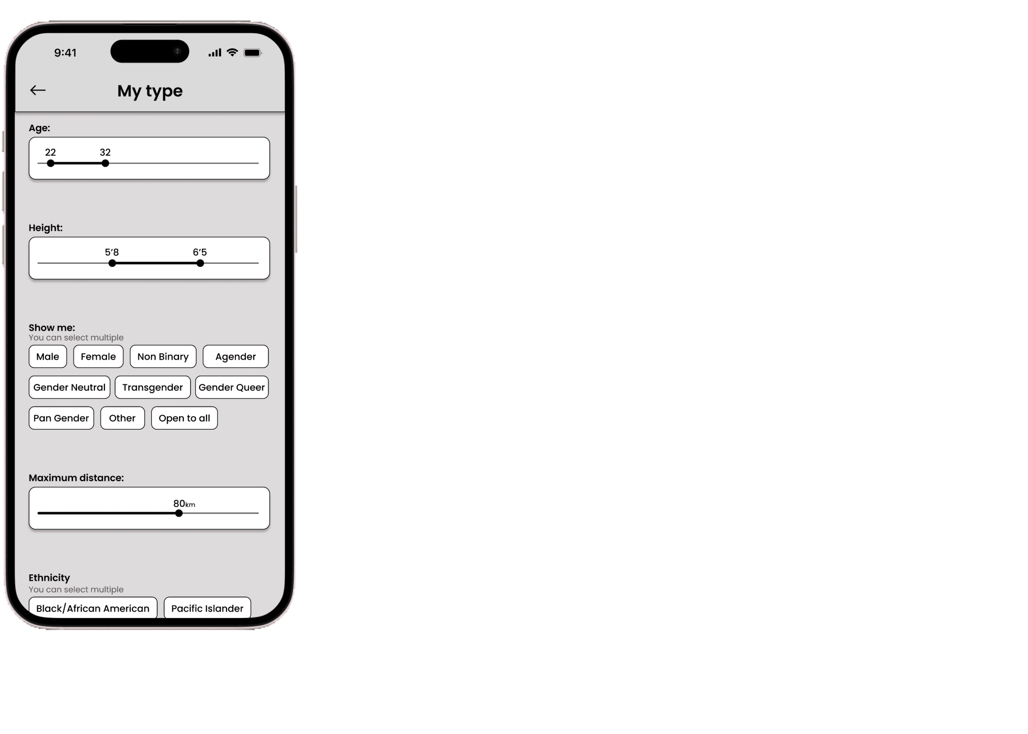
Low fidelity
Wireframes
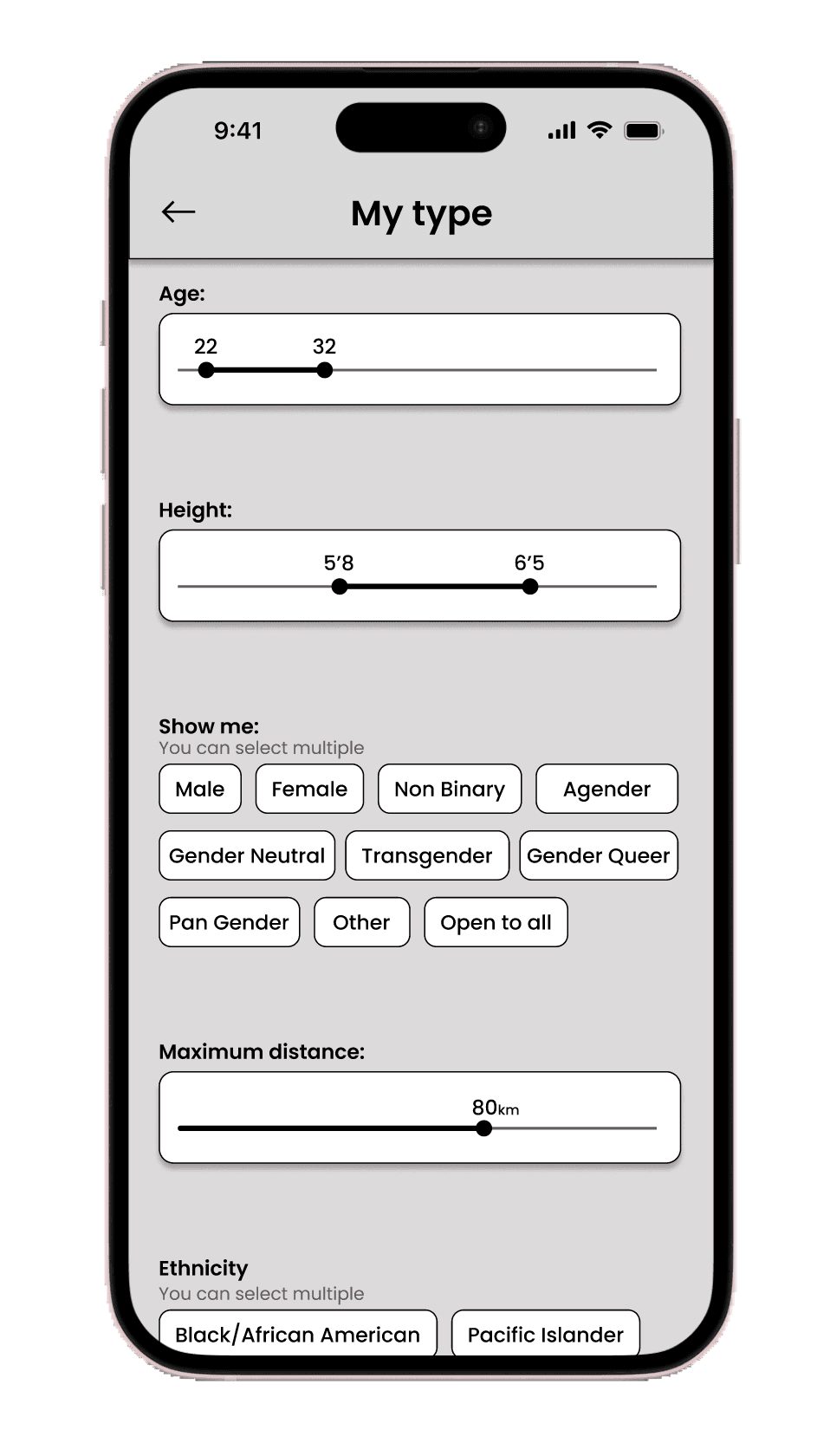
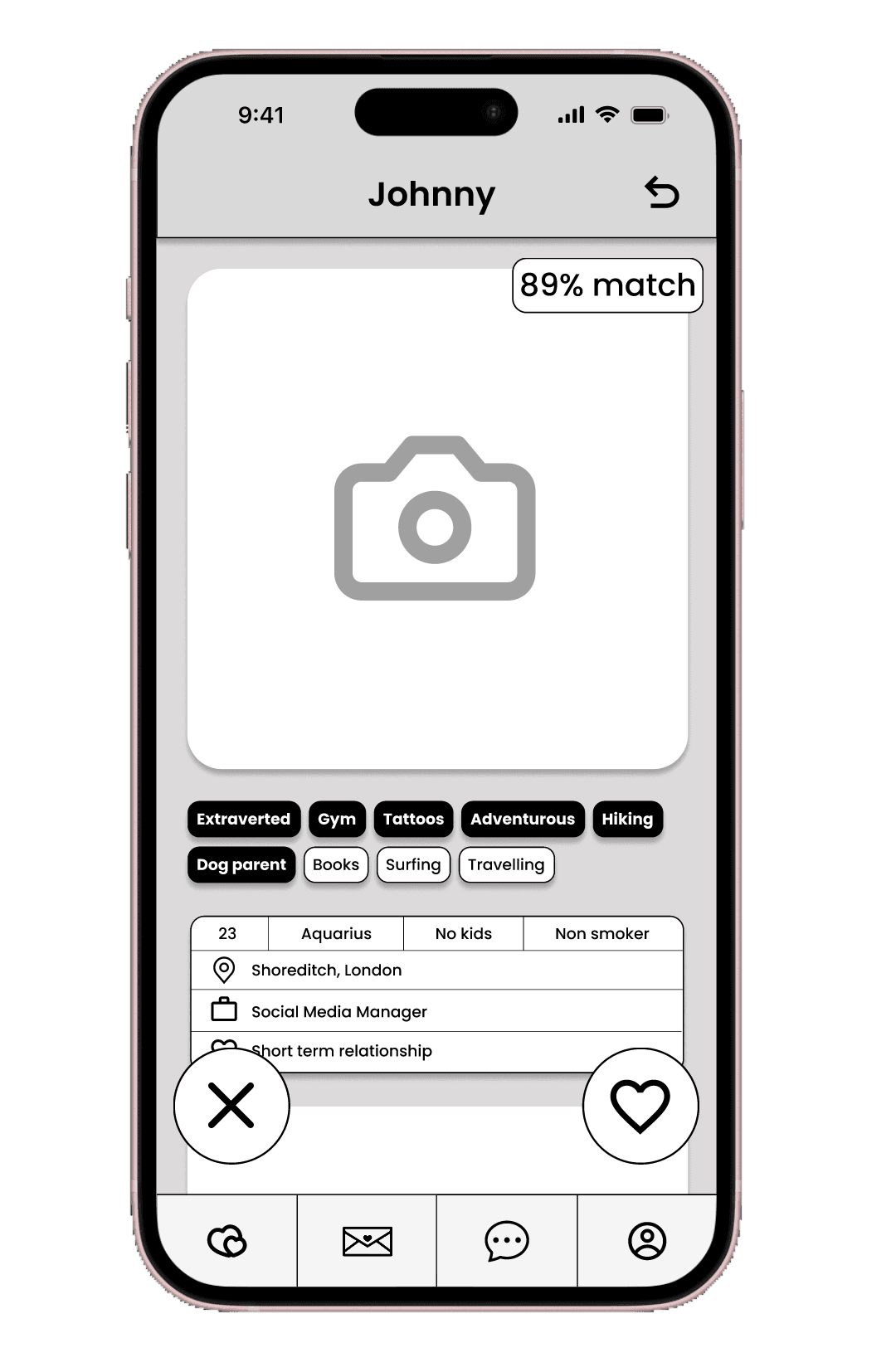
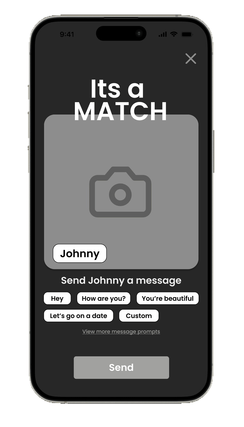
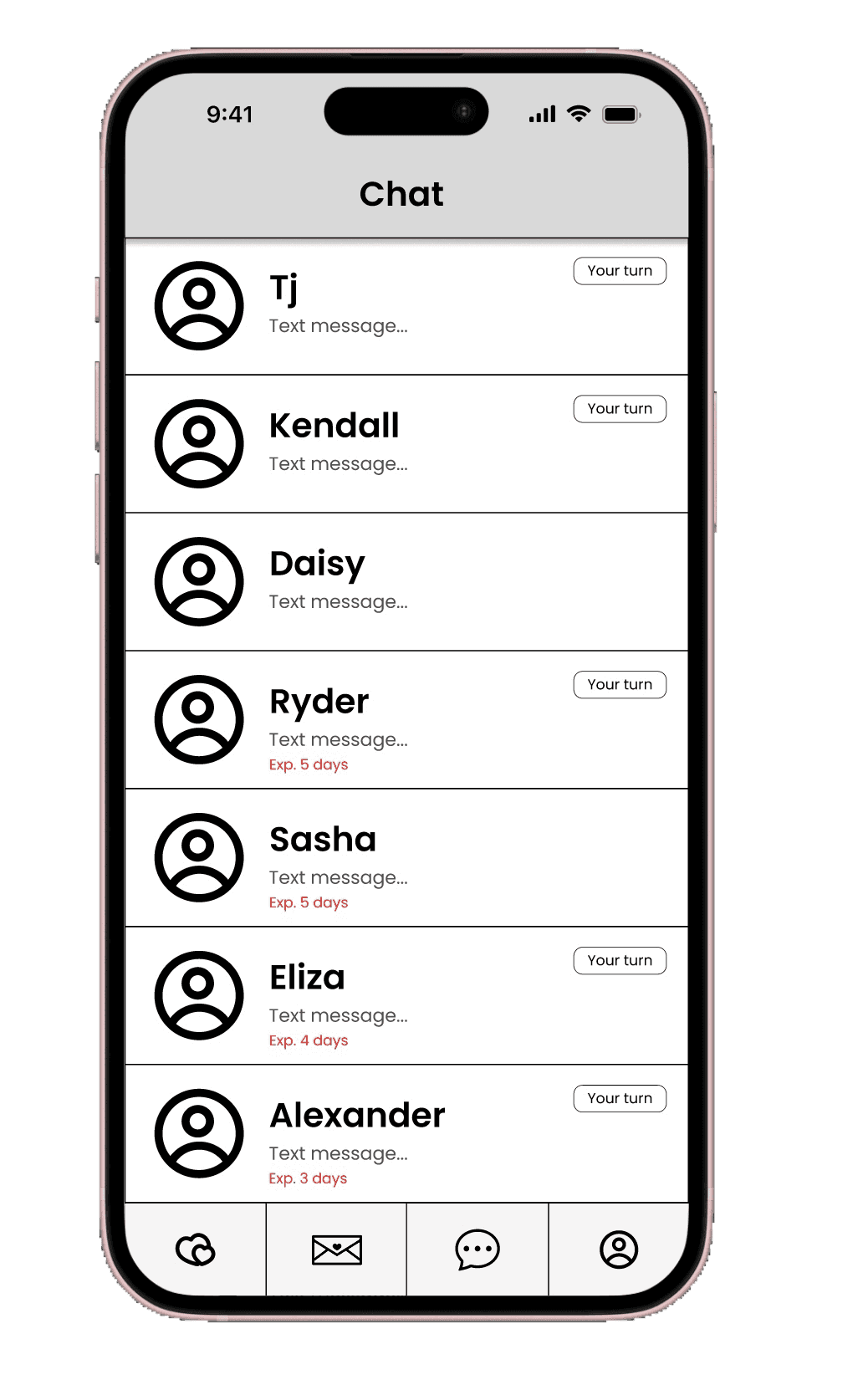
I've transformed my sketches into greyscale wireframes as part of the user testing process. This step helps ensure that users focus solely on the functionality and usability of the designs without being distracted by UI elements and aesthetics.

Current dating app experience
Experience mapping
Experience mapping in UX is the process of visually depicting a user's journey with a product or service.
It's invaluable because it provides insights into user emotions, needs, and interactions, helping designers identify areas for improvement and create user-centric solutions.
To better align my product with user needs and discover potential solutions, I created an experience map.
To spot opportunities for improvement, I visualised Madeline's current online dating experience.

User testing
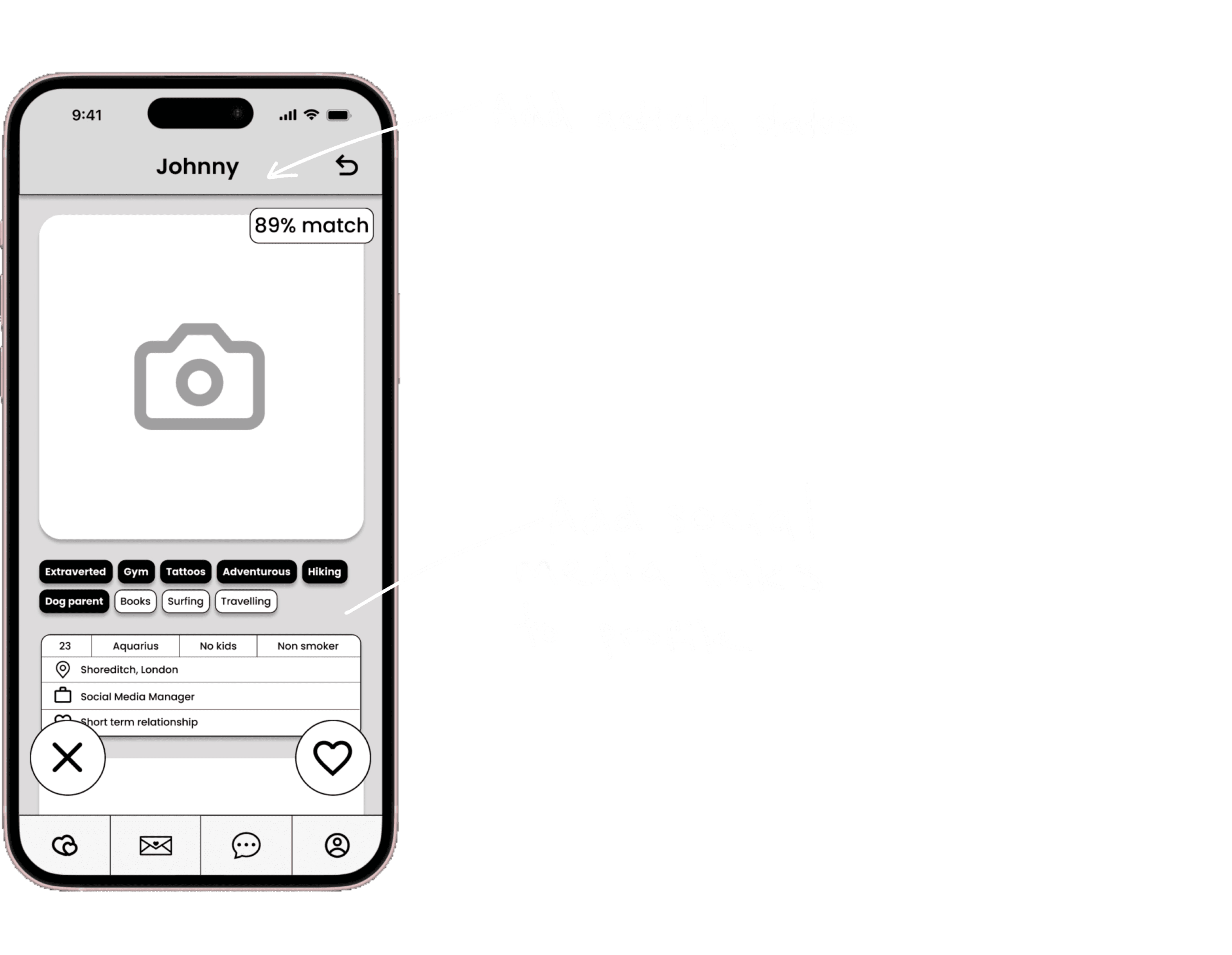
Observations
I proceeded to conduct user testing with eight different users, and here is the feedback I received:

Choosing brand aesthetic and values
Brand development
In developing my digital product, an integral step was to establish its brand identity.
To initiate this process, I began by documenting the core values and characteristics I believe my brand represents.
Adjectives:
Youthful, Innovative, Contemporary, Modern, Whimsical, Vibrant, Playful, Youthful, Dynamic, Refreshing, Trendy, Inviting
My brand is:
more dark than light
more futuristic than retro
more experiential than transactional
more vibrant than dull
more about celebrating diversity than fitting into boxes
more about fun exploration than rigid dating rules
more about personalised preferences than one-size-fits-all matchmaking
more about embracing every preference than just the mainstream
Moodboard
I crafted a mood board to encapsulate and communicate the intended ambiance for my app. This board serves as a visual representation of the aesthetic and emotional tone I aspire to establish. My goal is for the brand to exude a modern feel, with a significant influence from LED lights. I aim for it to be synonymous with youthfulness, vibrancy, and a sense of fun.

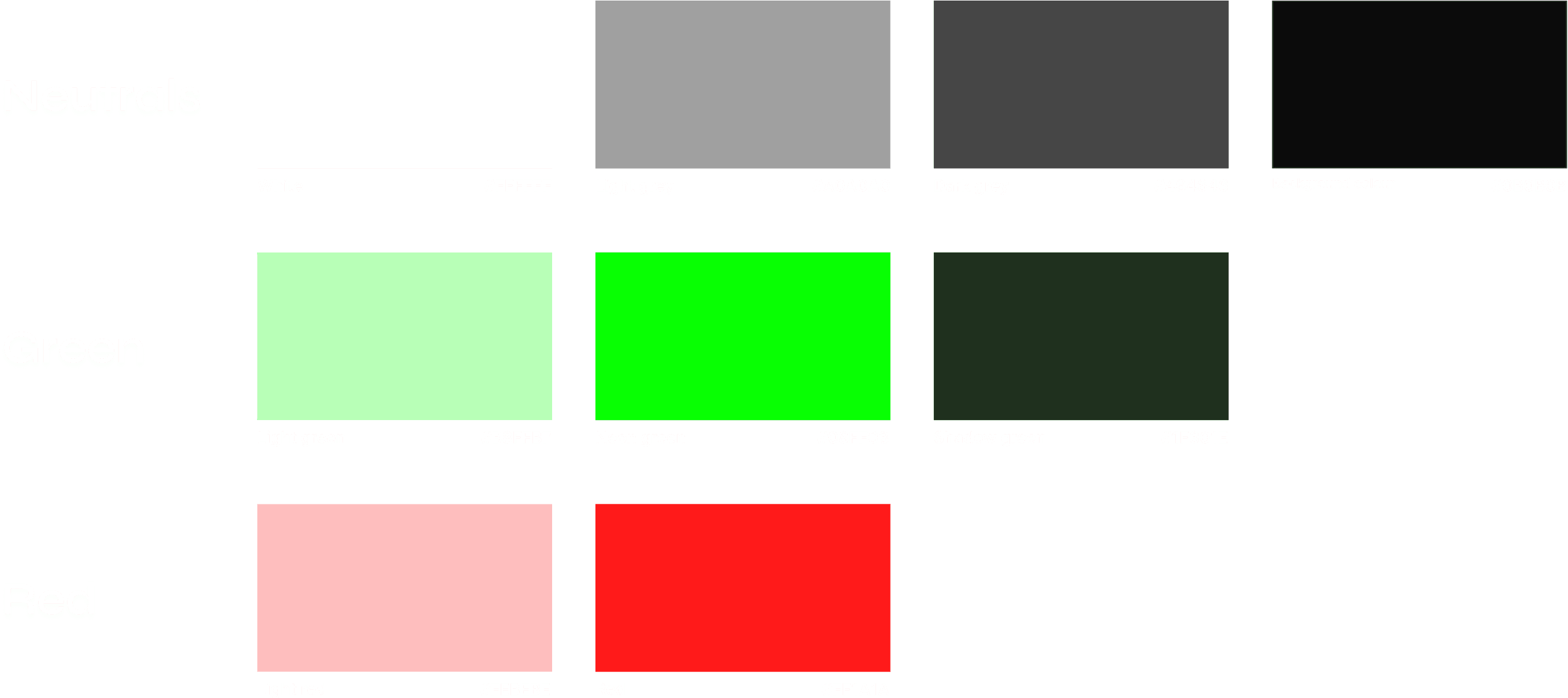
Developing a brand colour
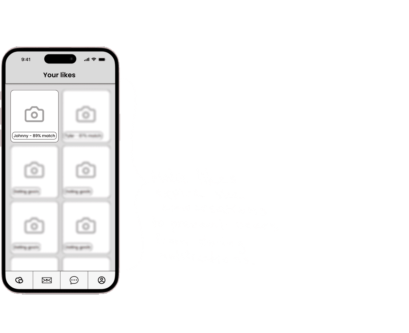
I've opted for neon green as the primary colour for our brand, as it captures the vibrant and contemporary feel we're aiming for.
The inspiration drawn from the LED glow effect of green lights has been integrated into the app's design, reinforcing its trendy, youthful appearance.
Name exploration
While brainstorming potential brand names for the upcoming phase of my project, I focused on capturing the essence of my brand and the key concepts I wanted the name to reflect.
This included emphasising our identity as a contemporary, fashionable dating platform that distinguishes itself by offering users an advanced way to precisely define their preferences, surpassing what current dating apps offer.

I've decided on the name MyType, as it encapsulates the concept of our dating platform, which allows users to specify their preferences in greater detail compared to our competitors.
Additionally, the name implies that it's a platform for messaging, aligning well with the app's functionality and purpose.
Wordmark exploration
In this process, I've experimented with a range of fonts and wordmarks to identify the one that most effectively embodies the brand and its values.

Brainstorming solutions
Sketches
While I initiated the process of sketching potential design solutions, I maintained a strong focus on the persona and her anticipated user journey. Empathising with Madeline, I ensured that my sketches aimed to effectively address her pain points and provide solutions through the proposed designs.
Creating an account
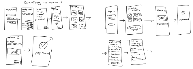

While developing the sign-up process, I placed significant emphasis on profile authentication to ensure the authenticity of all users on the dating app. To achieve this, I integrated ID verification into the process, ensuring that profile names and ages align with the actual information. Additionally, users are required to upload a selfie as an extra measure to prevent impersonation.
Our users highly value the assurance that everyone they encounter on our app is a genuine profile. While I recognise that this verification process can be a bit time-consuming, I want to emphasise that it's a one-time requirement during account creation. This approach ensures a safer and more trustworthy environment for all users.
Footer
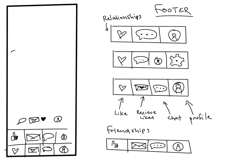

In the footer design, I experimented with various tab orders and conducted user testing with my peers to determine the most user-friendly layout. Additionally, I prepared a different footer variation for a potential "Friendship Finder" version of the app, which is a feature I plan to develop in the future. This approach ensures that the footer is intuitive for current users while being adaptable for future enhancements.
Profile
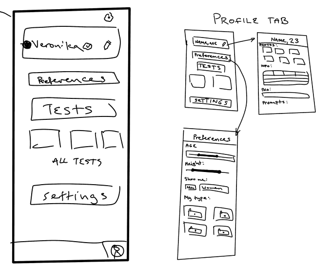

When designing the profile tab, I drew inspiration from several competitors and incorporated my favourite features into it. The profile tab prominently features edit profile and edit preferences options, which seamlessly redirect users to dedicated pages for making changes.
Beneath these options, I introduced compatibility quizzes that serve a dual purpose. Firstly, they provide a fun and interactive element to engage users. Secondly, they offer valuable insights into each user's preferences and behaviours, allowing us to present more compatible profiles. These quizzes are mandatory, and the compatibility percentage displayed on each profile is based on the results.
In addition to the mandatory quizzes, there is also an extensive selection of optional quizzes available to users. These quizzes further enhance our understanding of their preferences, helping us refine the matching process to meet their specific criteria and desires.
Chat
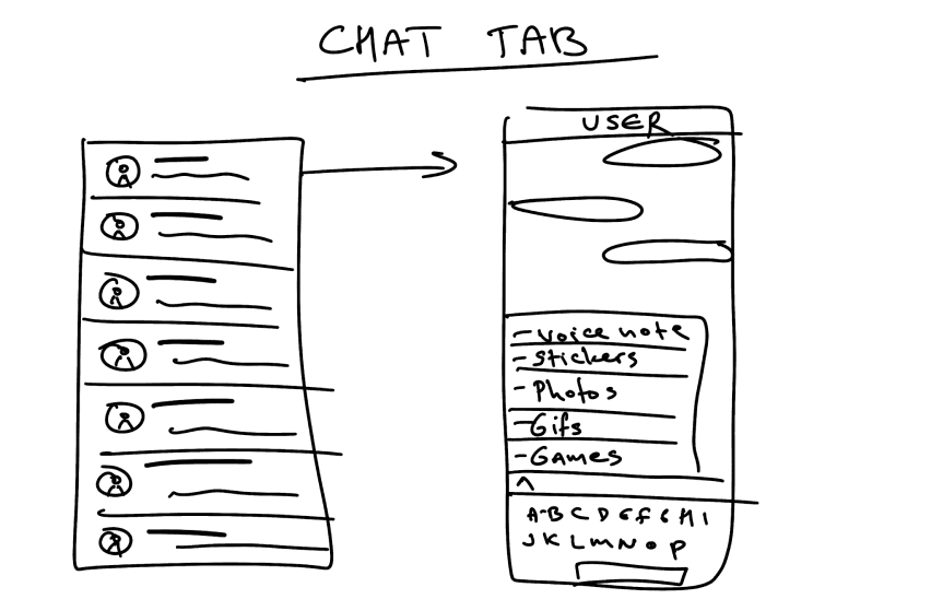

In designing the chat page, I've prioritised aligning with users' expectations for the layout. I've also ensured that when messaging, users have the freedom to express themselves fully. This includes the ability to send photos, videos, voice notes, and GIFs, as well as play virtual games like 8 ball pool and darts within the chat.
These features are aimed at helping users break the ice and engage in more interactive conversations. Additionally, I've implemented expiring conversations as a valuable element. This ensures that users are intentional in their matches and conversations. If users haven't been in contact for over a month, whether they've exchanged numbers or lost interest, the conversations will expire and be removed.
Likes
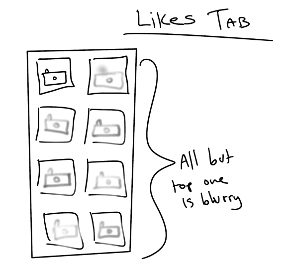

On the "Like" page, I've implemented an expiring element to discourage users from accumulating likes and to encourage activity on the app. To ensure fairness, I've arranged likes with the most recent ones appearing at the bottom, following a first-come-first-serve principle. Only the top like is displayed clearly, while the others remain blurred. Users must either match or decline the top profile to unblur the next one.
To maintain a dynamic environment, profiles that users don't interact with within a week will eventually disappear. This approach promotes user engagement and ensures that profiles aren't forgotten or left stagnant.
Low fidelity
Wireframes
I've transformed my sketches into greyscale wireframes as part of the user testing process. This step helps ensure that users focus solely on the functionality and usability of the designs without being distracted by UI elements and aesthetics.


App functionality
Task flows
After the ideation phase and crafting user stories, I pinpointed the crucial functionalities for the app.
I've developed a step-by-step sequence illustrating how users can perform two key tasks within my app: setting up their account and preferences, and initiating a match and conversation.
This sequence offers a visual representation of user interactions and system responses throughout these processes.


Setting up account
Primary task flow
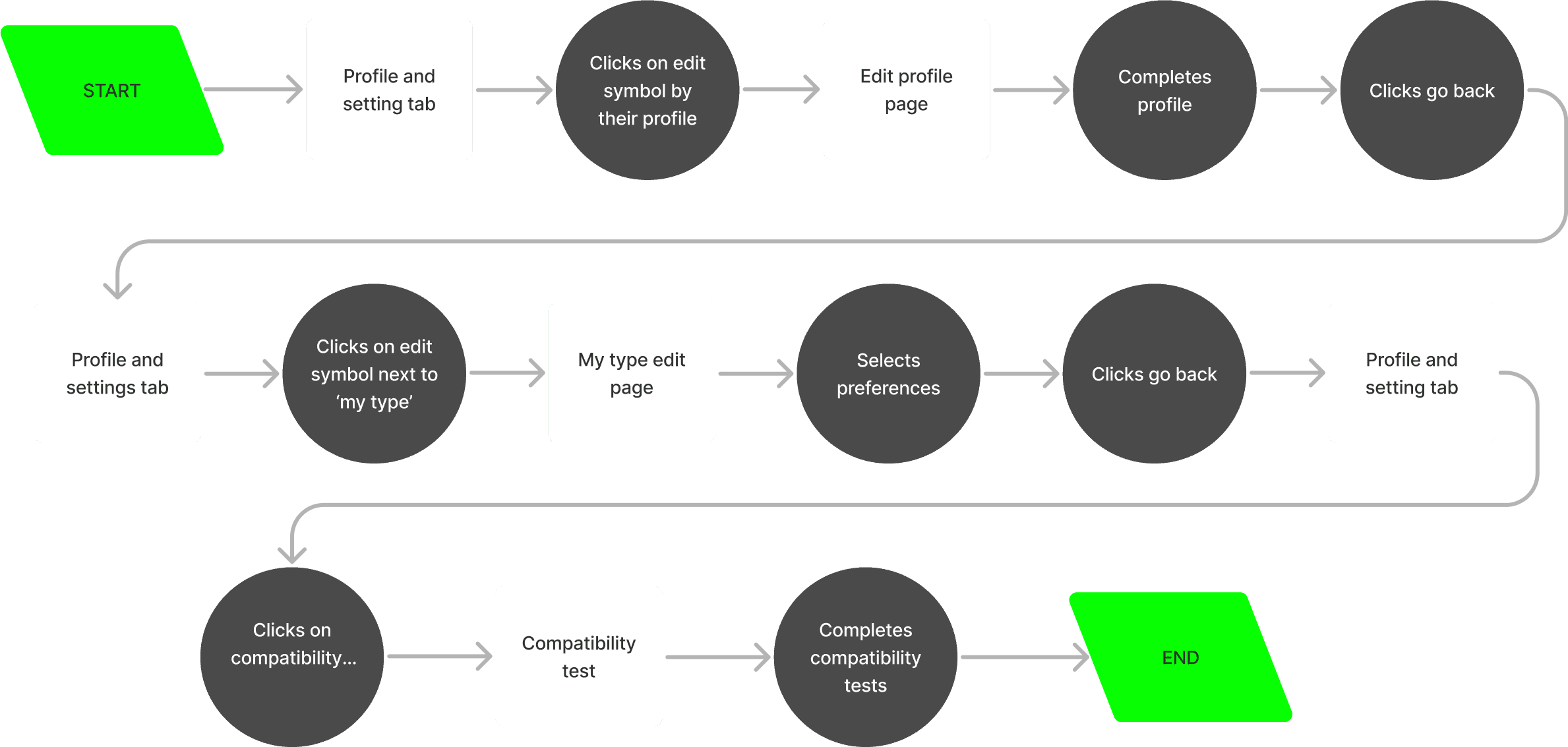

Logging in and creating an account is a standard and necessary step in most apps. However, in my task flow, I've chosen to bypass this initial step to focus on the app's functionality once the user is logged in, where the exciting part begins.
After the user verifies their email, uploads identification, and gets approved, they are directed to their profile. In this specific scenario, let's take Madeline as an example. Madeline proceeds to enhance her profile by adding photos and sharing more about herself. Once her profile is complete, she fine-tunes her preferences, specifying precisely what she's looking for and expecting from the app.
To help the algorithms better understand her compatibility preferences, she decides to engage in the fun and interactive Compatibility tests available within her profile.
Matching & sending a message
Secondary task flow


Interacting with other user profiles on the app is a fundamental action for all users. I've illustrated this process in the secondary task flow,
In this flow, you can observe Madeline as she browses through the suggested profiles. As she indicates her interest by either accepting or declining them, the algorithm becomes better at understanding her preferences and presenting more accurate matching profiles.
When Madeline encounters a user profile that piques her interest and results in a mutual like, she proceeds to the "It's a Match" page. At this point, Madeline takes the initiative to send the first message. However, unsure of what to say, she explores the suggested message prompts to help her break the ice and initiate a conversation.
User testing
Observations
I proceeded to conduct user testing with eight different users, and here is the feedback I received:



Choosing brand aesthetic and values
Brand development
In developing my digital product, an integral step was to establish its brand identity.
To initiate this process, I began by documenting the core values and characteristics I believe my brand represents.
Adjectives:
Youthful, Innovative, Contemporary, Modern, Whimsical, Vibrant, Playful, Youthful, Dynamic, Refreshing, Trendy, Inviting
My brand is:
more dark than light
more futuristic than retro
more experiential than transactional
more vibrant than dull
more about celebrating diversity than fitting into boxes
more about fun exploration than rigid dating rules
more about personalised preferences than one-size-fits-all matchmaking
more about embracing every preference than just the mainstream
Moodboard
I crafted a mood board to encapsulate and communicate the intended ambiance for my app. This board serves as a visual representation of the aesthetic and emotional tone I aspire to establish. My goal is for the brand to exude a modern feel, with a significant influence from LED lights. I aim for it to be synonymous with youthfulness, vibrancy, and a sense of fun.

Final wordmark
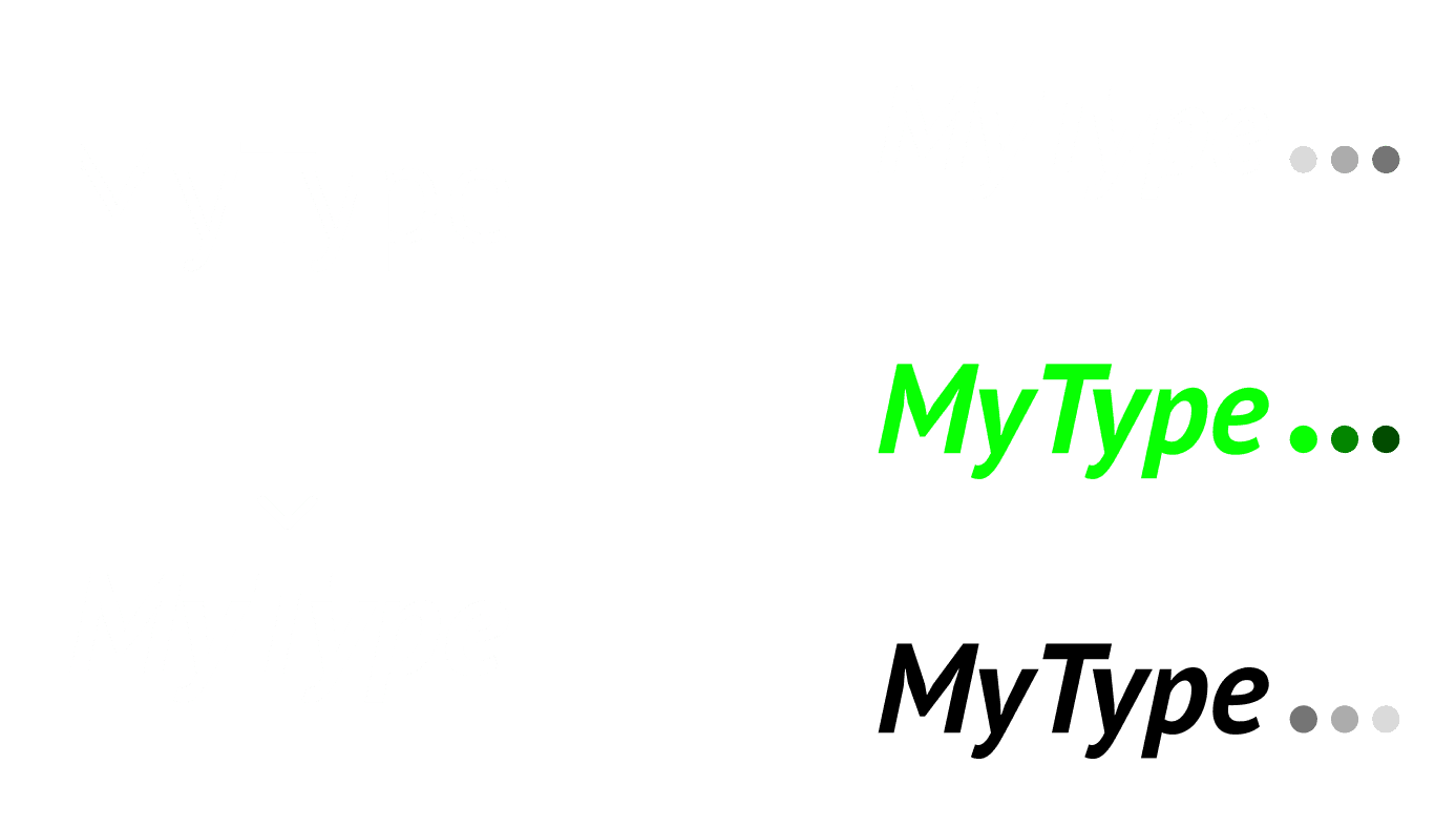
I've selected PT Sans in bold italic because its simplicity resonates with the contemporary aesthetic that our brand embodies.
Name exploration
While brainstorming potential brand names for the upcoming phase of my project, I focused on capturing the essence of my brand and the key concepts I wanted the name to reflect.
This included emphasising our identity as a contemporary, fashionable dating platform that distinguishes itself by offering users an advanced way to precisely define their preferences, surpassing what current dating apps offer.


I've decided on the name MyType, as it encapsulates the concept of our dating platform, which allows users to specify their preferences in greater detail compared to our competitors.
Additionally, the name implies that it's a platform for messaging, aligning well with the app's functionality and purpose.
Wordmark exploration
In this process, I've experimented with a range of fonts and wordmarks to identify the one that most effectively embodies the brand and its values.


Final wordmark
I've selected PT Sans in bold italic because its simplicity resonates with the contemporary aesthetic that our brand embodies.


Application icon
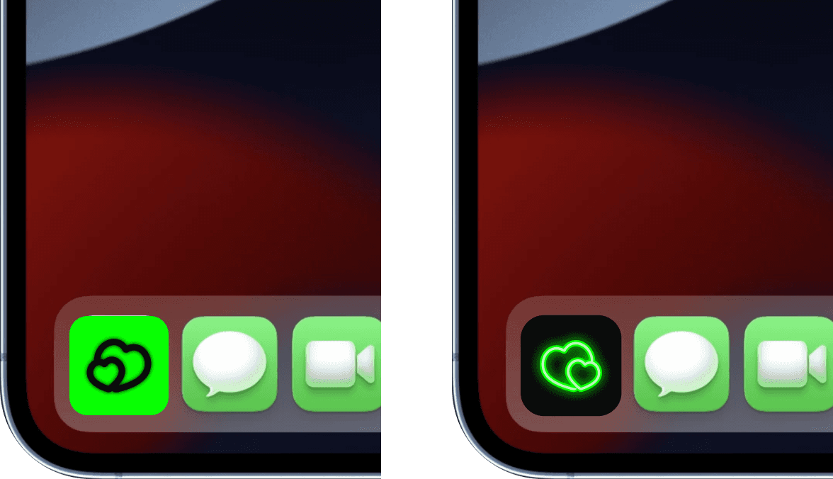
For the logo, I've decided on a simple double heart design, and I have developed versions of this logo for both dark and light modes to ensure versatility and appeal across different user preferences and settings.

Typography
When selecting typography, I opted for a combination of quirky titles and simple text. This choice creates a striking contrast between a playful and sleek aesthetic, adding depth and character to the design.


Colour testing
Prior to finalising any decisions, I conducted experimentation with various colour palettes on one of my high-fidelity screens. This step was essential to ensure that my vision was brought to life, and that the selected brand colours harmonised perfectly with the overall design concept I had in mind.


High fidelity
Final design
Creating an account
At MyType, we place a strong emphasis on authenticity and ensure that all users are genuine. Here, you can observe the steps a new user must follow to create an account and start using the app.
Selecting your preference
MyType offers a highly refined preference selection process, even down to your physical type. This meticulous approach ensures that every user is presented with profiles that precisely match their preferences, reducing the presence of time-wasting accounts and, ultimately, minimising the burnout that users often experience with current dating apps.
Liking a profile
Liking a profile on MyType has never been easier! When you come across someone who piques your interest, we'll assist you in starting the conversation and breaking the ice. MyType provides a variety of message prompts that become more customised to each user based on their typical first messages over time.
This feature effectively eliminates the awkwardness of having to think of what to say, making the interaction smoother and more enjoyable.
Matching a profile that liked you
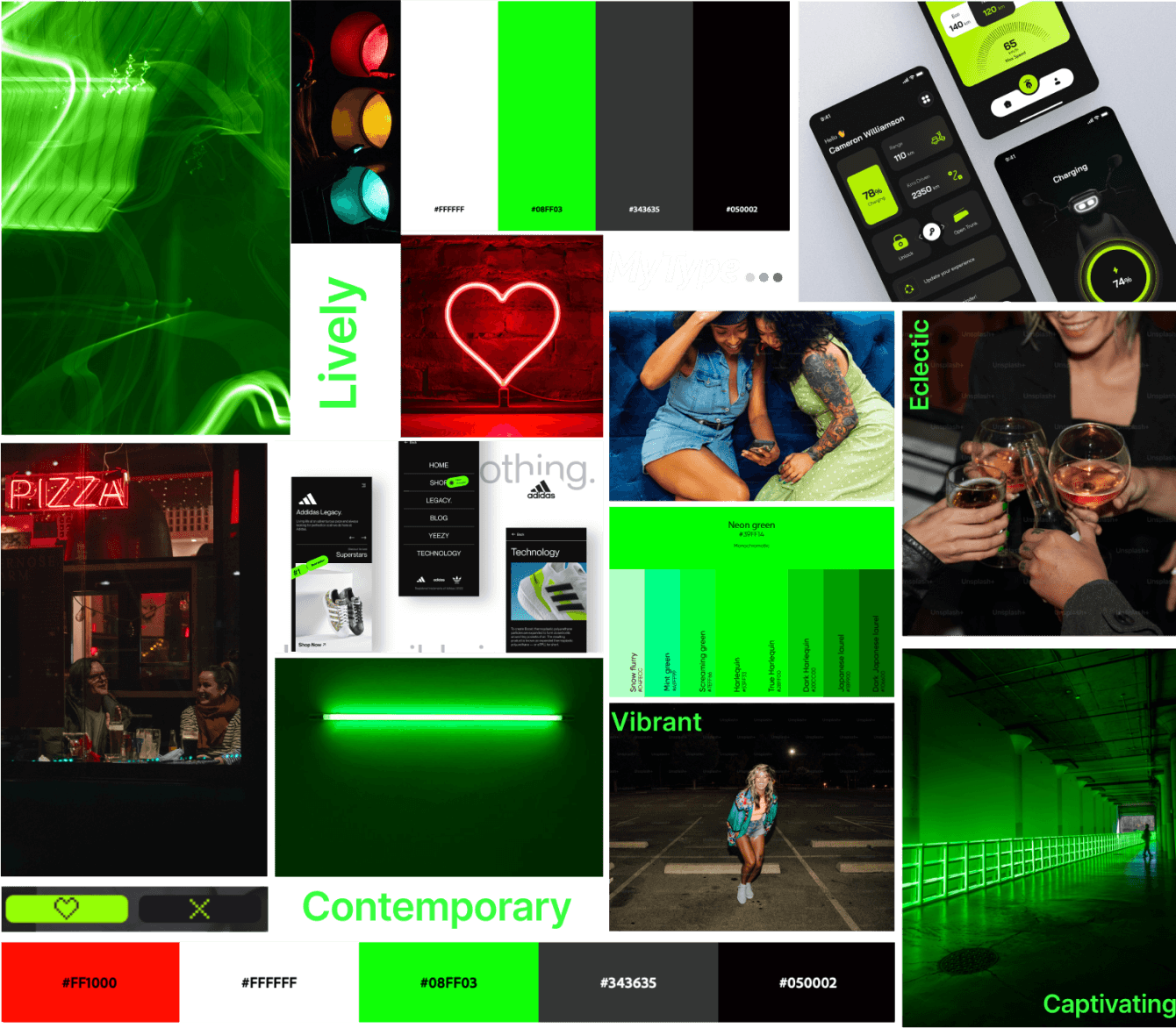
When users browse their likes, they can only view the least recent like clearly at the top, while all other profiles remain blurred until the first one is either matched or rejected.
Additionally, there's a one-week timeframe for users to make a decision.
This approach prevents users from accumulating likes without engaging and encourages them to respond to other users within a reasonable time frame.
Messaging
The messaging feature on MyType surpasses that of our competitors by offering users greater freedom and a wider range of communication options. In addition to sending regular text messages, users can send photos, videos, voice notes, GIFs, their location, and even play games within the platform.
Similar to the likes feature, messages also have an expiry mechanism. If a conversation remains inactive for over one month, whether due to users exchanging personal information and choosing to communicate elsewhere or simply deciding to discontinue contact, the conversation will disappear. This ensures that the platform remains dynamic and focuses on active interactions.
Gaining visibility to attract prospective users
Marketing website
When it comes to discovering new apps and products, the majority of young adults rely on online sources for guidance. While my app is designed for individuals aged 18 and above, its modern interface is particularly attractive to singles in their 20s.
To capitalise on this appeal, I've developed a marketing website prototype to showcase my product and connect with potential users. Additionally, I plan to leverage social media platforms like Instagram and TikTok for promotional purposes.
Desktop:
Mobile:
Key learnings
Recognising the significance of user testing
I've come to understand the crucial role of continuous user testing during each adjustment and enhancement phase. Even after incorporating necessary changes following mid-fidelity design and initial user testing, it became evident that further testing was essential. This iterative approach allows for early identification of potential improvements.
Emphasising accessibility and inclusivity
I've gained an appreciation for the importance of integrating accessibility and inclusivity principles into both the user experience (UX) and user interface (UI) design. Given that my app aims to cater to a wide range of users, I focused on ensuring that my design choices, such as brand colours and aesthetics, did not exclude any demographic. As a result, I opted for a green colour palette over my initial idea of a pink scheme, which had the potential to deter male users.
Success metrics
Given that this project was undertaken for academic purposes, it has not been released for user interaction at this time. Nevertheless, I will outline how I would hypothetically assess its success and the steps I would take when/if the app is eventually launched.
Set up analytics tools
I would integrate user analytics tools into my app to collect user data. Ensure I am tracking relevant user interactions.
Segmentation
I would Segment my user base to better understand their behaviour. I would segment by demographics, location, age, and user activity.
Data collection
I would collect data on user registrations, interactions, messages, matches, and other relevant actions within the app.
Monitor user engagement
I would regularly monitor daily, weekly, and monthly active users (DAU, WAU, MAU), and their session duration to gauge user engagement.
Retention analysis
I would analyse user retention rates over time. Identifying when users tend to drop off and take steps to improve retention unless it is caused by successful match making.
Feedback and ratings
I would closely monitor user ratings and reviews on app stores. Paying attention to user feedback for insights into app improvements.
Safety and trust metrics
I intend to keep track of reported incidents, harassment cases, and trust and safety ratings, implementing measures to ensure user safety.
Developing a brand colour
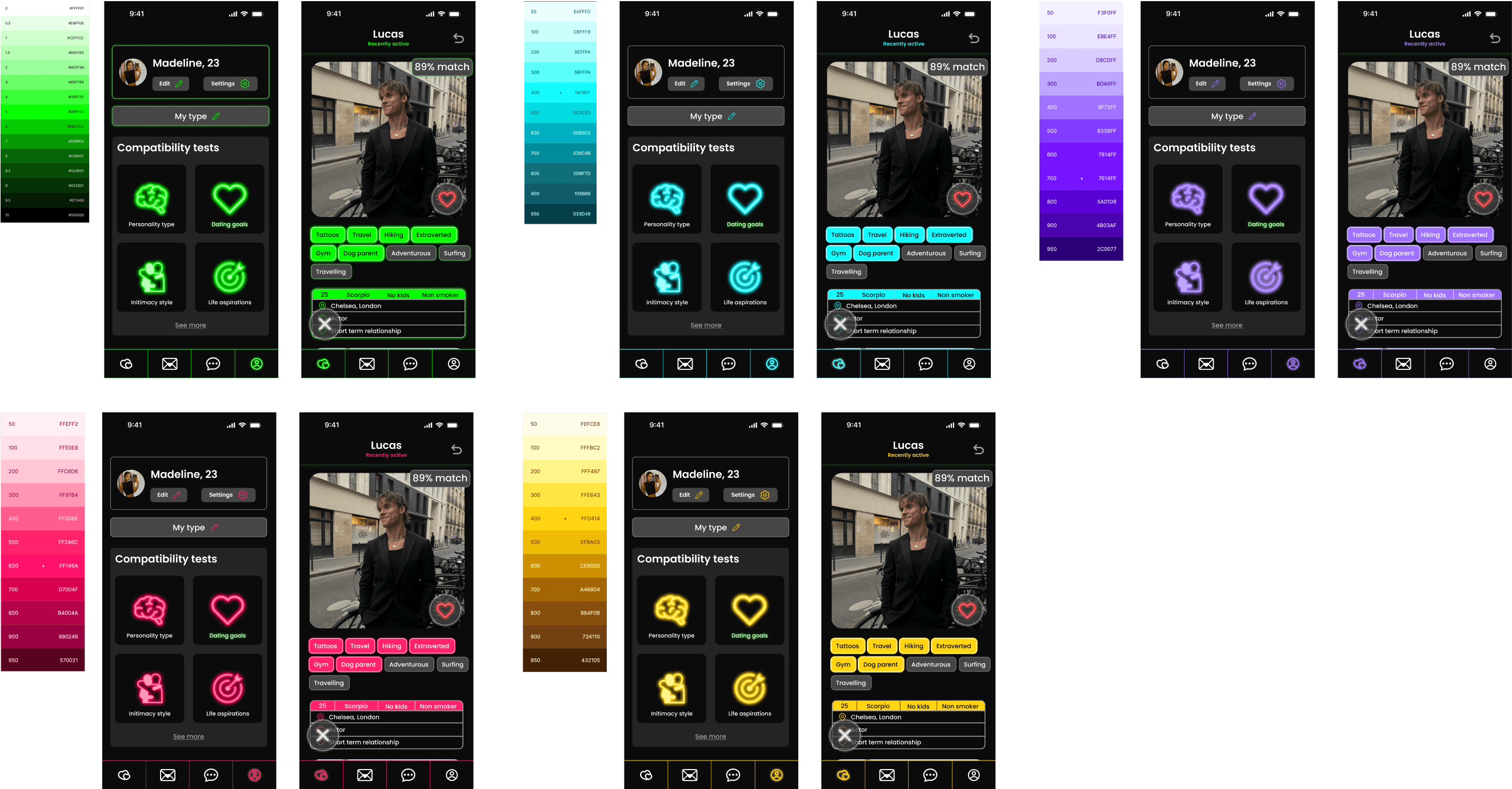
I've opted for neon green as the primary colour for our brand, as it captures the vibrant and contemporary feel we're aiming for.
The inspiration drawn from the LED glow effect of green lights has been integrated into the app's design, reinforcing its trendy, youthful appearance.


Application icon
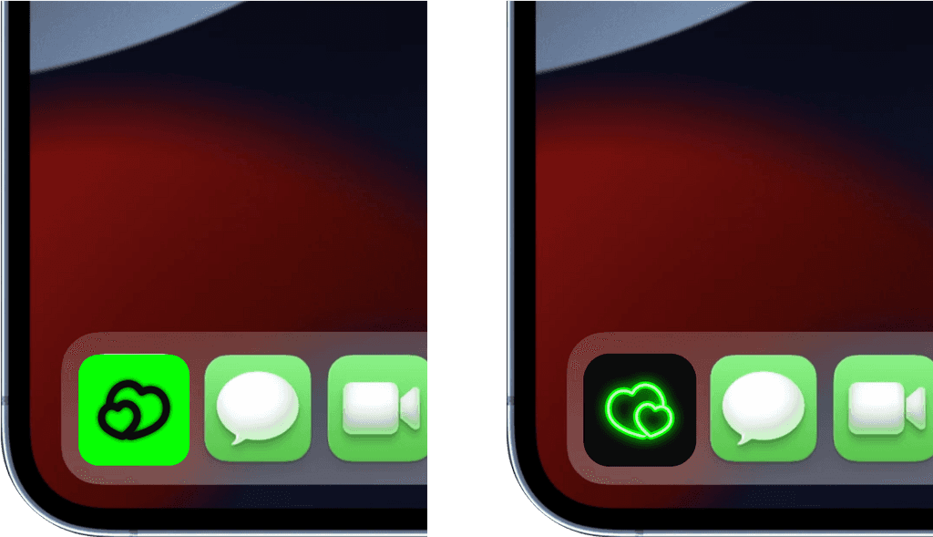
For the logo, I've decided on a simple double heart design, and I have developed versions of this logo for both dark and light modes to ensure versatility and appeal across different user preferences and settings.
Typography
When selecting typography, I opted for a combination of quirky titles and simple text. This choice creates a striking contrast between a playful and sleek aesthetic, adding depth and character to the design.

Colour testing
Prior to finalising any decisions, I conducted experimentation with various colour palettes on one of my high-fidelity screens. This step was essential to ensure that my vision was brought to life, and that the selected brand colours harmonised perfectly with the overall design concept I had in mind.
High fidelity
Final designs
Creating an account
At MyType, we place a strong emphasis on authenticity and ensure that all users are genuine. Here, you can observe the steps a new user must follow to create an account and start using the app.
Selecting your preference
MyType offers a highly refined preference selection process, even down to your physical type. This meticulous approach ensures that every user is presented with profiles that precisely match their preferences, reducing the presence of time-wasting accounts and, ultimately, minimising the burnout that users often experience with current dating apps.
Liking a profile
Liking a profile on MyType has never been easier! When you come across someone who piques your interest, we'll assist you in starting the conversation and breaking the ice. MyType provides a variety of message prompts that become more customised to each user based on their typical first messages over time.
This feature effectively eliminates the awkwardness of having to think of what to say, making the interaction smoother and more enjoyable.
Matching a profile that liked you
When users browse their likes, they can only view the least recent like clearly at the top, while all other profiles remain blurred until the first one is either matched or rejected.
Additionally, there's a one-week timeframe for users to make a decision.
This approach prevents users from accumulating likes without engaging and encourages them to respond to other users within a reasonable time frame.
Messaging
The messaging feature on MyType surpasses that of our competitors by offering users greater freedom and a wider range of communication options. In addition to sending regular text messages, users can send photos, videos, voice notes, GIFs, their location, and even play games within the platform.
Similar to the likes feature, messages also have an expiry mechanism. If a conversation remains inactive for over one month, whether due to users exchanging personal information and choosing to communicate elsewhere or simply deciding to discontinue contact, the conversation will disappear. This ensures that the platform remains dynamic and focuses on active interactions.
Gaining visibility to attract prospective users
Marketing website
When it comes to discovering new apps and products, the majority of young adults rely on online sources for guidance. While my app is designed for individuals aged 18 and above, its modern interface is particularly attractive to singles in their 20s.
To capitalise on this appeal, I've developed a marketing website prototype to showcase my product and connect with potential users. Additionally, I plan to leverage social media platforms like Instagram and TikTok for promotional purposes.
Desktop:
Mobile
Key learnings
Recognising the Significance of User Testing
I've come to understand the crucial role of continuous user testing during each adjustment and enhancement phase. Even after incorporating necessary changes following mid-fidelity design and initial user testing, it became evident that further testing was essential. This iterative approach allows for early identification of potential improvements.
Emphasising Accessibility and Inclusivity
I've gained an appreciation for the importance of integrating accessibility and inclusivity principles into both the user experience (UX) and user interface (UI) design. Given that my app aims to cater to a wide range of users, I focused on ensuring that my design choices, such as brand colours and aesthetics, did not exclude any demographic. As a result, I opted for a green colour palette over my initial idea of a pink scheme, which had the potential to deter male users.
Success metrics
Given that this project was undertaken for academic purposes, it has not been released for user interaction at this time. Nevertheless, I will outline how I would hypothetically assess its success and the steps I would take when/if the app is eventually launched.
Set Up Analytics Tools
I would integrate user analytics tools into my app to collect user data. Ensure I am tracking relevant user interactions.
Segmentation
I would Segment my user base to better understand their behaviour. I would segment by demographics, location, age, and user activity.
Data Collection
I would collect data on user registrations, interactions, messages, matches, and other relevant actions within the app.
Monitor User Engagement
I would regularly monitor daily, weekly, and monthly active users (DAU, WAU, MAU), and their session duration to gauge user engagement.
Retention Analysis
I would analyse user retention rates over time. Identifying when users tend to drop off and take steps to improve retention unless it is caused by successful match making.
Feedback and Ratings
I would closely monitor user ratings and reviews on app stores. Paying attention to user feedback for insights into app improvements.
Safety and Trust Metrics
I intend to keep track of reported incidents, harassment cases, and trust and safety ratings, implementing measures to ensure user safety.
