Jakob Nielsen's 10 fundamental usability heuristics are widely recognised guidelines for interface design, aimed at improving user experience.
The 10 heuristics are:
Visibility of System Status
The system should always keep users informed about what is going on, through appropriate feedback within reasonable time.
Match Between System and the Real World
The system should speak the users' language, with words, phrases, and concepts familiar to the user, rather than system-oriented terms. Follow real-world conventions, making information appear in a natural and logical order.
User Control and Freedom
Users often choose system functions by mistake and will need a clearly marked "emergency exit" to leave the unwanted state without having to go through an extended dialogue. Support undo and redo.
Consistency and Standards
Users should not have to wonder whether different words, situations, or actions mean the same thing. Follow platform conventions.
Error Prevention
Even better than good error messages is a careful design which prevents a problem from occurring in the first place. Either eliminate error-prone conditions or check for them and present users with a confirmation option before they commit to the action.
Recognition Rather Than Recall
Minimise the user's memory load by making objects, actions, and options visible. The user should not have to remember information from one part of the dialogue to another. Instructions for use of the system should be visible or easily retrievable whenever appropriate.
Flexibility and Efficiency of Use
Accelerators—unseen by the novice user—may often speed up the interaction for the expert user such that the system can cater to both inexperienced and experienced users. Allow users to tailor frequent actions.
Aesthetic and Minimalist Design
Dialogues should not contain information which is irrelevant or rarely needed. Every extra unit of information in a dialogue competes with the relevant units of information and diminishes their relative visibility.
Help Users Recognise, Diagnose, and Recover from Errors
Error messages should be expressed in plain language (no codes), precisely indicate the problem, and constructively suggest a solution.
Help and Documentation
Even though it is better if the system can be used without documentation, it may be necessary to provide help and documentation. Any such information should be easy to search, focused on the user's task, list concrete steps to be taken, and not be too large.
For one of my projects, I was tasked with learning and applying heuristic evaluation to a website of my choosing within a one week timeframe.
Heuristic evaluation involves examining a user interface to assess its adherence to established usability guidelines, termed heuristics.
What is Zara?
Zara is a well-known fast-fashion retail brand offering trendy clothing and accessories for men, women, and children.
It's part of the Inditex group, one of the world's largest apparel retailers, and operates numerous stores globally as well as an online shopping platform.


Usability heuristics:
selecting a specific task flow
I intend to assess the Zara website using Jakob Nielsen’s 10 fundamental usability heuristics, aiming to thoroughly investigate its shortcomings.
Firstly, I have established a task flow demonstrating what a typical user may do on the Zara website (browse, look up item, add to cart, open live chat) in order to evaluate its compliance with these usability principles.
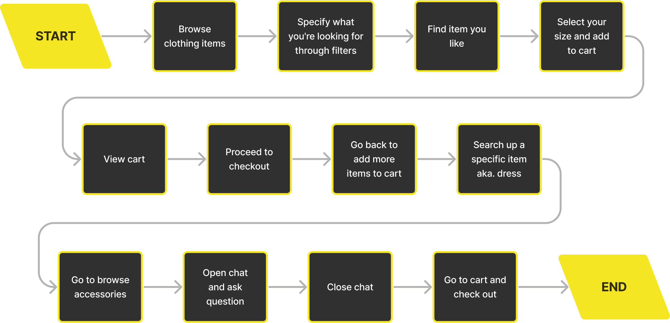

Current website task flow demo
Here I am showcasing the present user experience on the Zara website and highlighting any issues users might face while navigating their site.


Chosen heuristics
I have categorised the problems I encountered on the Zara website into heuristics and below I will present the following issues.
Visibility of system status
Match between system and the real world
User control and freedom
Consistency and standards
Error prevention
Recognition rather than recall
Flexibility and efficiency of use
Aesthetic and minimalist design
Help users recognise, diagnose, and recover from errors
Help and documentation
Visibility of system status
The design should always keep users informed about what is going on, through appropriate feedback within a reasonable time.
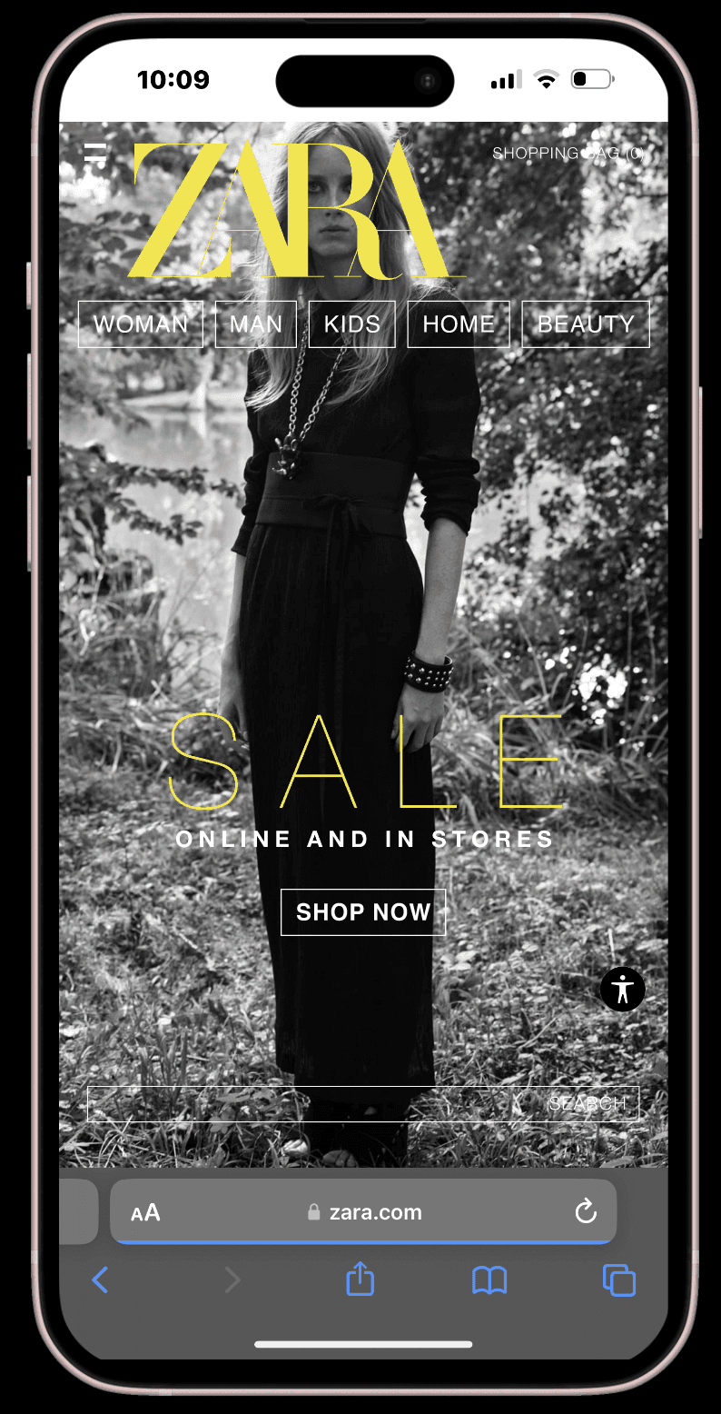
No clear call to action button on the home page
Leaves users unsure about what action to take, especially with primary and secondary navigation being hidden behind the very subtle hamburger menu
Hamburger menu hides primary and secondary navigation
Plenty of confusing interaction
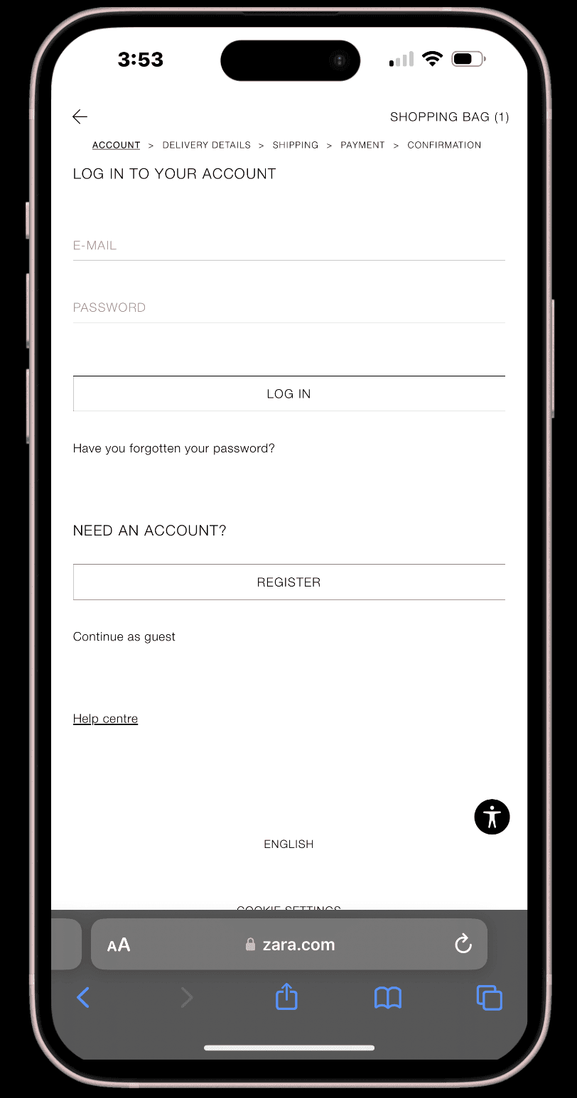
No progress indicator when in shopping cart
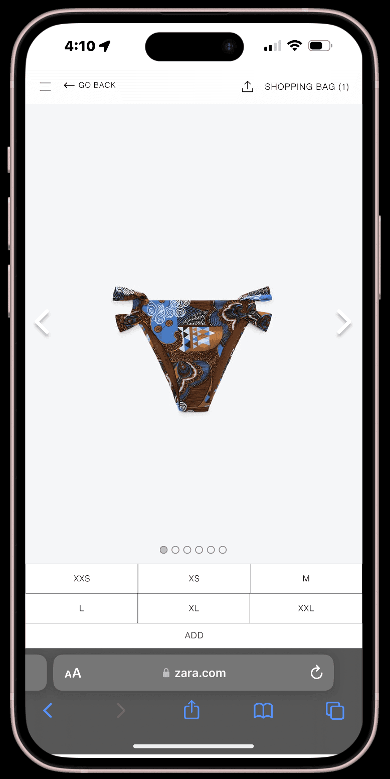
Hard to see the actual product in the imagery
No shopping cart logo


User control and freedom
Users often perform actions by mistake. They need a clearly marked "emergency exit" to leave the unwanted state without having to go through an extended process.
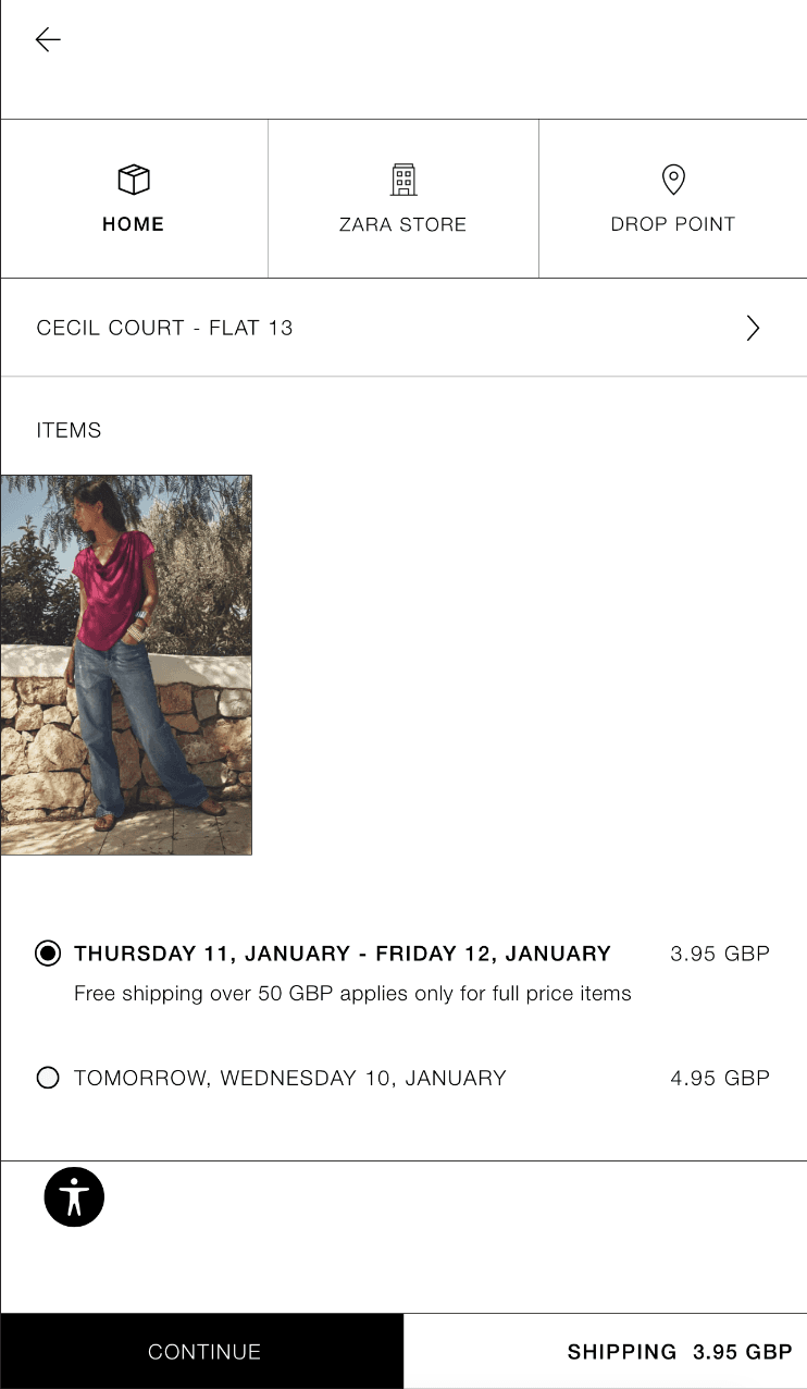
If item is added to cart accidentally, no easy direct way of removing it through the pop up screen
Cant change size of item without removing it from cart and adding it again from scratch
When searching up a specific item, the ‘woman’, ‘man’, etc. tabs don’t lead you anywhere
When browsing there are only ‘sale’ or ‘new collection’ tabs


Consistency and standards
Users should not have to wonder whether different words, situations, or actions mean the same thing. Follow platform and industry conventions.
Product images are inconsistent
Vertical scrolling through images instead of horizontal
Inconsistent imagery makes sizing unreliable for users as products are demonstrated in a bizarre way


Error prevention
Design the system so that users cannot make serious errors, or at least make it easy to detect and correct them.
Size isn’t visible prior to ‘add’ button
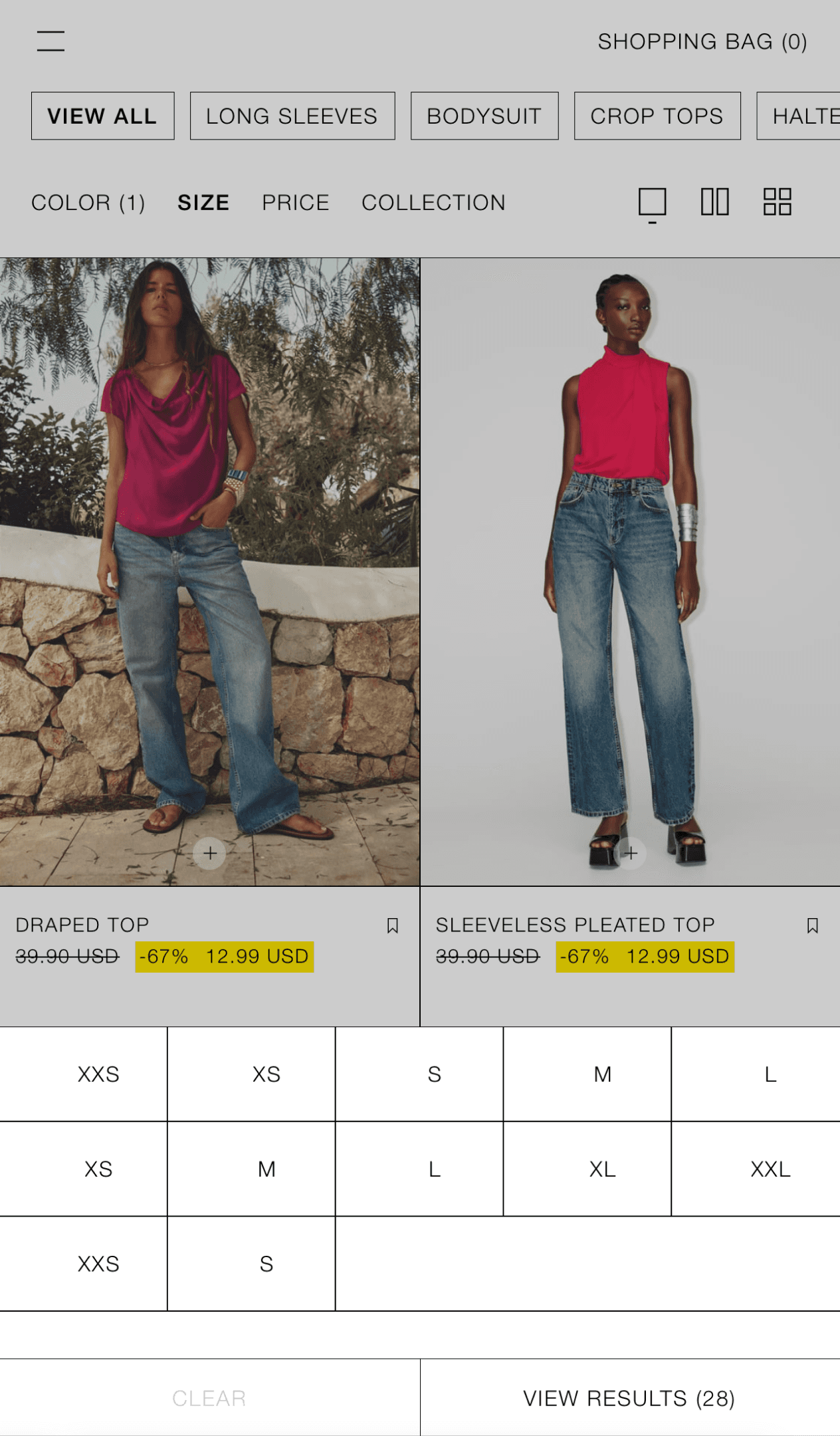
Two of every size is presented when trying to filter items, only one of them is functioning - the other will lead to ‘no results’
‘close’ and ‘cancel’ buttons when closing chat can be confusing


Help and documentation
It’s best if the system doesn’t need any additional explanation. Any such information should be easy to search, focused on the user's task, concise, and list concrete steps to be followed.
There are no navigation buttons or icons to assist users in returning to browsing.
The only option available for users to go back to the homepage is the ZARA word mark.
No progress indicator - difficult to return to desired page
No ‘add to cart’ option prior to clicking on individual item
Lack of hierarchy of information on tabs and filters
Chat button is very difficult to access


Usability issues
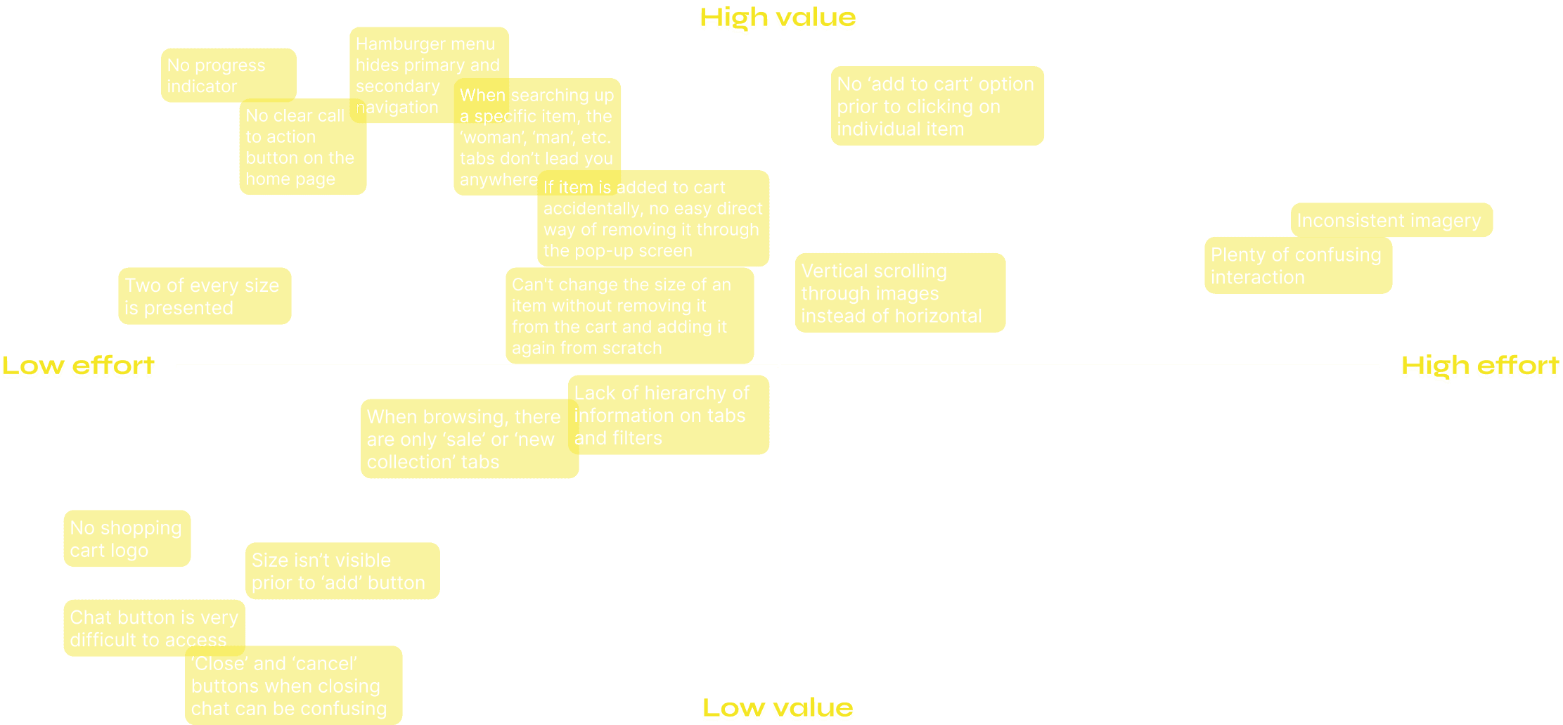
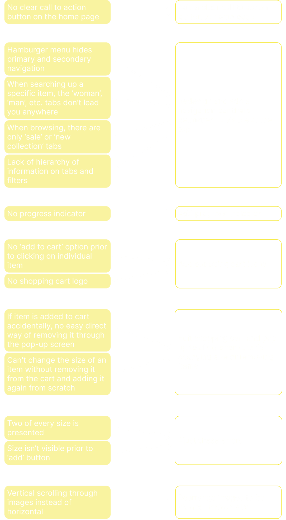
I have organised the identified issues from most to least severe to assist in prioritising which problems to address first and to construct a design prioritisation matrix.
Most
severe
Mid
Least
severe
Hamburger menu hides primary and secondary navigation:
No progress indicator - difficult to return to desired page
Plenty of confusing interaction
Inconsistent imagery makes sizing unreliable for users as products are demonstrated in a bizarre way
No clear call to action button on the home page
There are no navigation buttons or icons to assist users in returning to browsing
When searching up a specific item, the ‘woman’, ‘man’, etc. tabs don’t lead you anywhere
Lack of hierarchy of information on tabs and filters
No ‘add to cart’ option prior to clicking on individual item
Two of every size is presented when trying to filter items, only one of them is functioning - the other will lead to ‘no results’:
Size isn’t visible prior to ‘add’ button
Can't change the size of an item without removing it from the cart and adding it again from scratch
If item is added to cart accidentally, no easy direct way of removing it through the pop-up screen
Vertical scrolling through images instead of horizontal
When browsing, there are only ‘sale’ or ‘new collection’ tabs
Chat button is very difficult to access
‘Close’ and ‘cancel’ buttons when closing chat can be confusing
No shopping cart logo
Design prioritisation matrix
I have developed a design prioritisation matrix that aids in determining which issues to address first. This step is crucial, particularly when operating under a tight schedule.

Recommended design improvements
I have identified some of the more critical issues and here are my suggested design enhancements for those problems. Next, I will start addressing these issues in Figma to create a tangible example of how I plan to implement improvements to resolve their current problems.

Updated designs
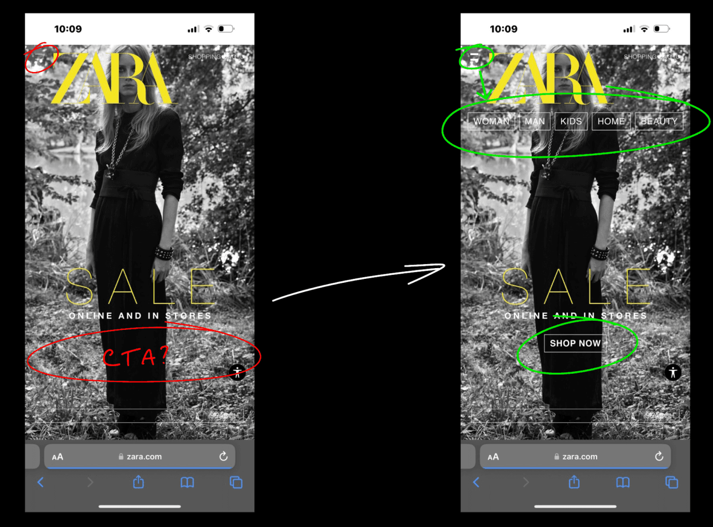
Here, I am presenting a comparison of the original website and my proposed improvements, showcasing the before and after.
Home page
No call to action button
Hamburger menu is hard to see
Hamburger menu hides primary and secondary navigation
Targeted heuristics: Visibility of system status & Help and documentation

Choosing a website
I've decided to focus on the Zara website for my Unit 4 project. As a regular Zara shopper, I've often found myself feeling frustrated with their website.
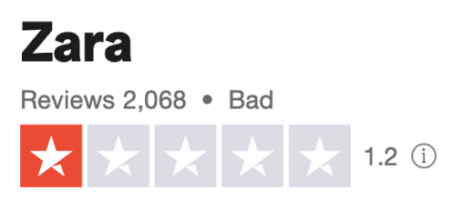
To ensure that my perspective isn't biased, I conducted some research and discovered that Zara's website has a low rating of 1.2 out of 5 stars on Trustpilot, accompanied by numerous user complaints labelling it as one of the worst websites they've encountered.
Given the tight timeframe and the challenge of completing a 2-week group project solo within just 5 days, I was unable to conduct user testing or engage in primary research.


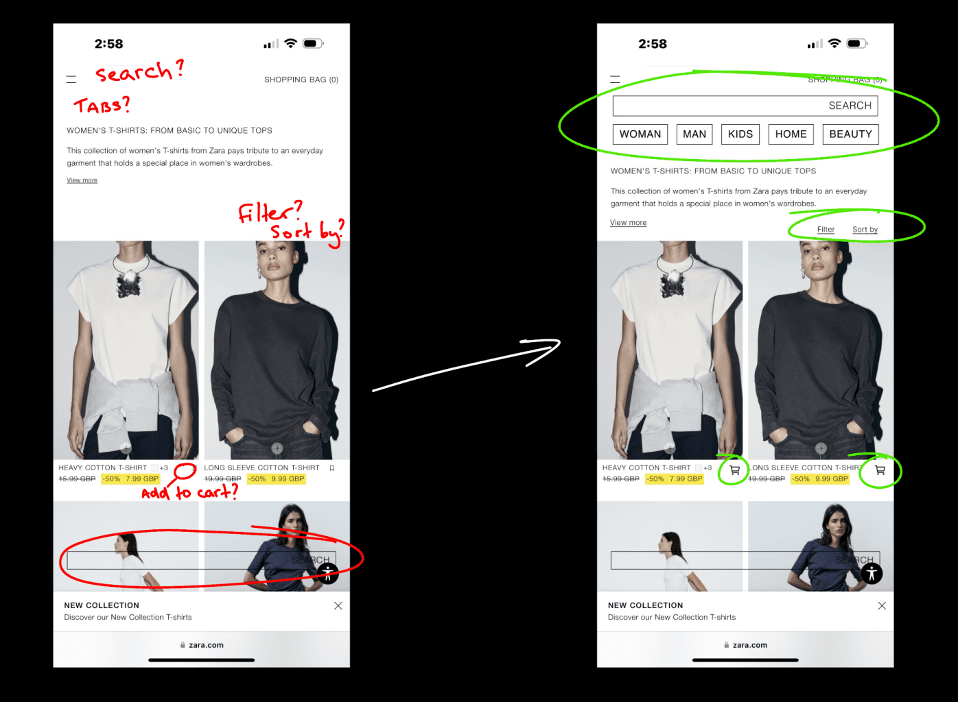
Browsing page
No immediate add to cart
Search bar is at the bottom and hard to see
No navigation bar/tabs
No Filter/Sort by
Targeted heuristics: visibility of system status

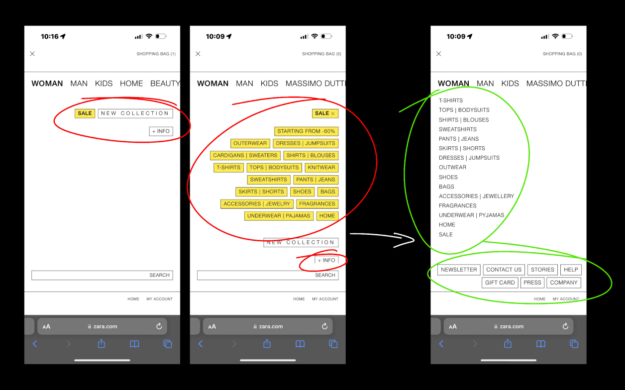
Hamburger menu
‘WOMAN’ ‘MAN’ tabs aren’t clickable
Only ‘SALE’ or ‘NEW COLLECTION’ tabs
Hard to find contact option
Targeted heuristics: Visibility of system status & User control and freedom

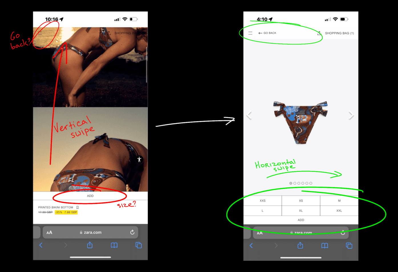
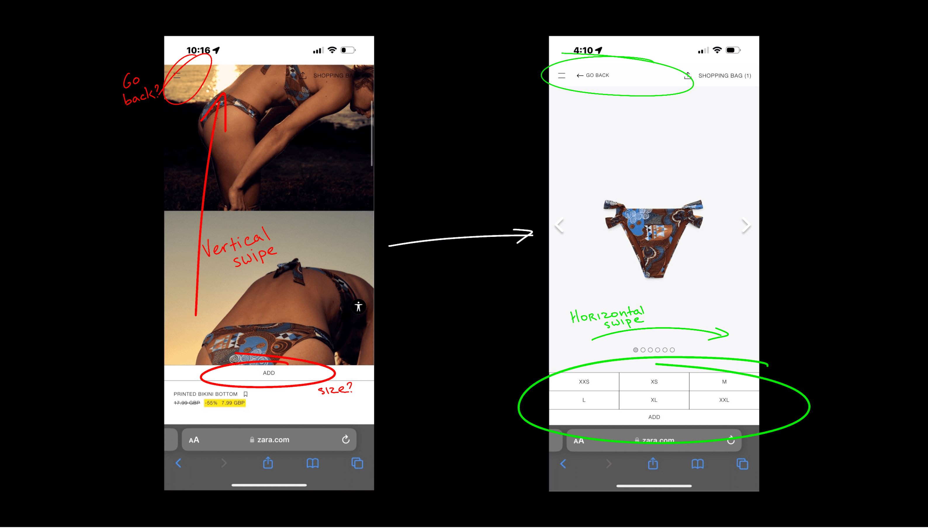
Item page
Inconsistent imagery shown first
Vertical swipe instead of the expected horizontal
No go back button (browser nav bar disappears)
No size shown prior to clicking ‘ADD’
Targeted heuristics: Visibility of system status, Error prevention, Consistency and standards, & Help and documentation

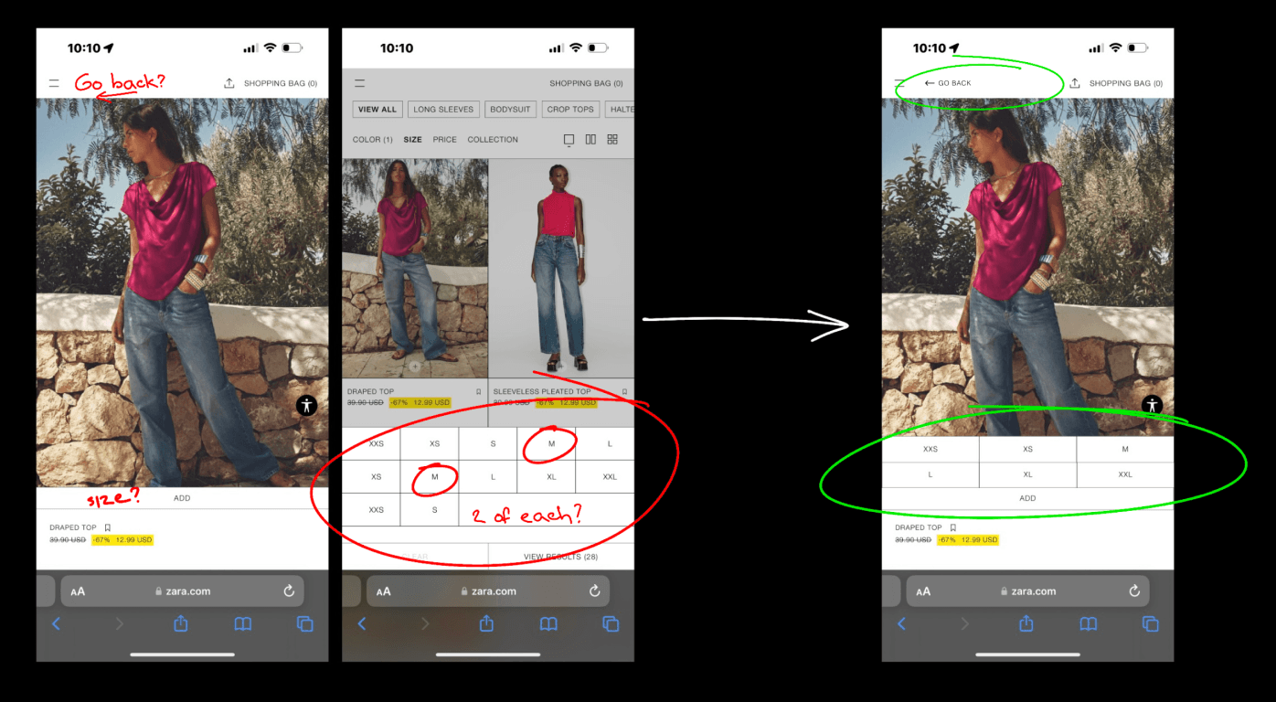
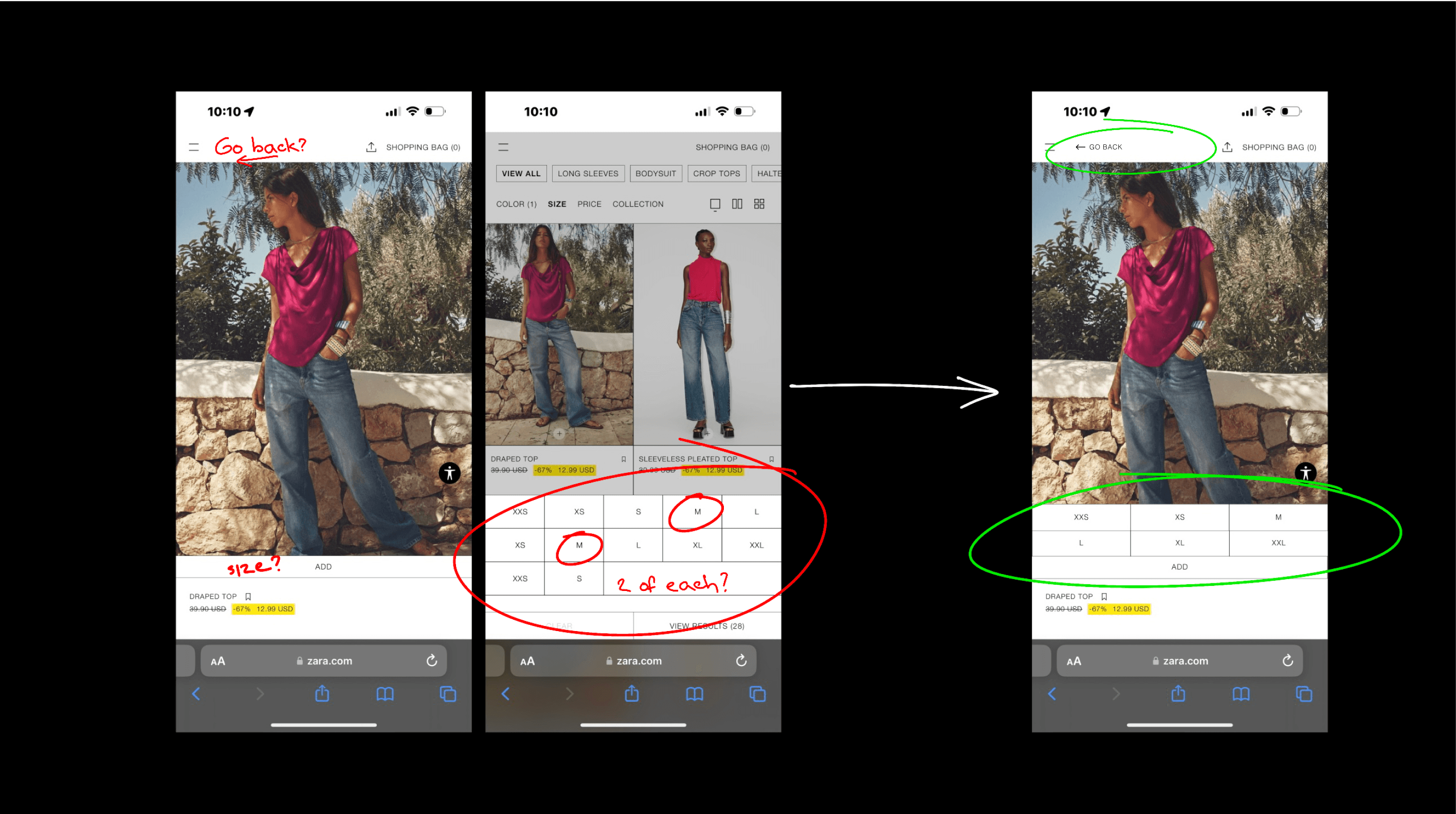
Adding to cart
No size shown prior to clicking ‘ADD’
Two of each size is shown when trying to filter by size
Only one of those two size option leads to desired outcome, other leads to ‘no results’
No go back button
Targeted heuristics: Error prevention & Help and documentation

Adding to cart pop up
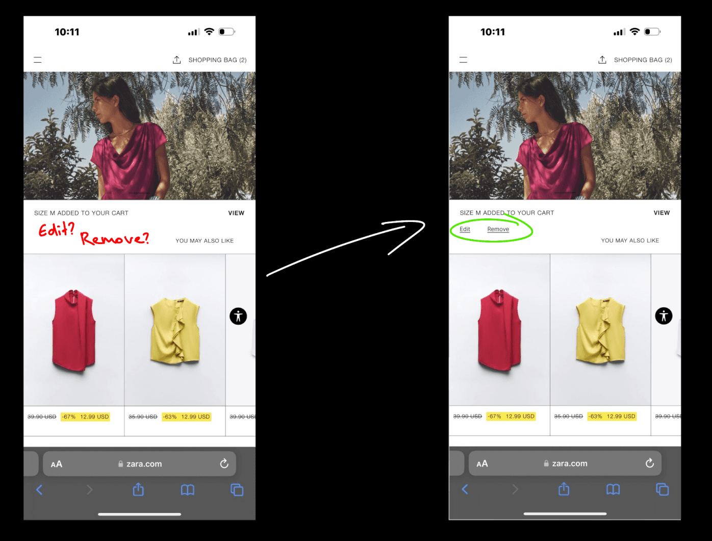
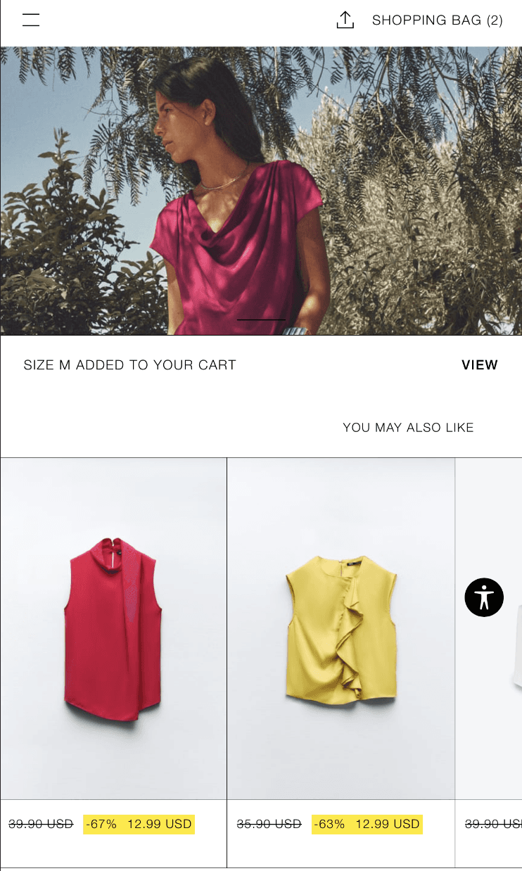
Once added to cart you cant edit or remove item without going to cart, deleting item and re-adding it again in the correct size
Targeted heuristics: User control and freedom & Help and documentation

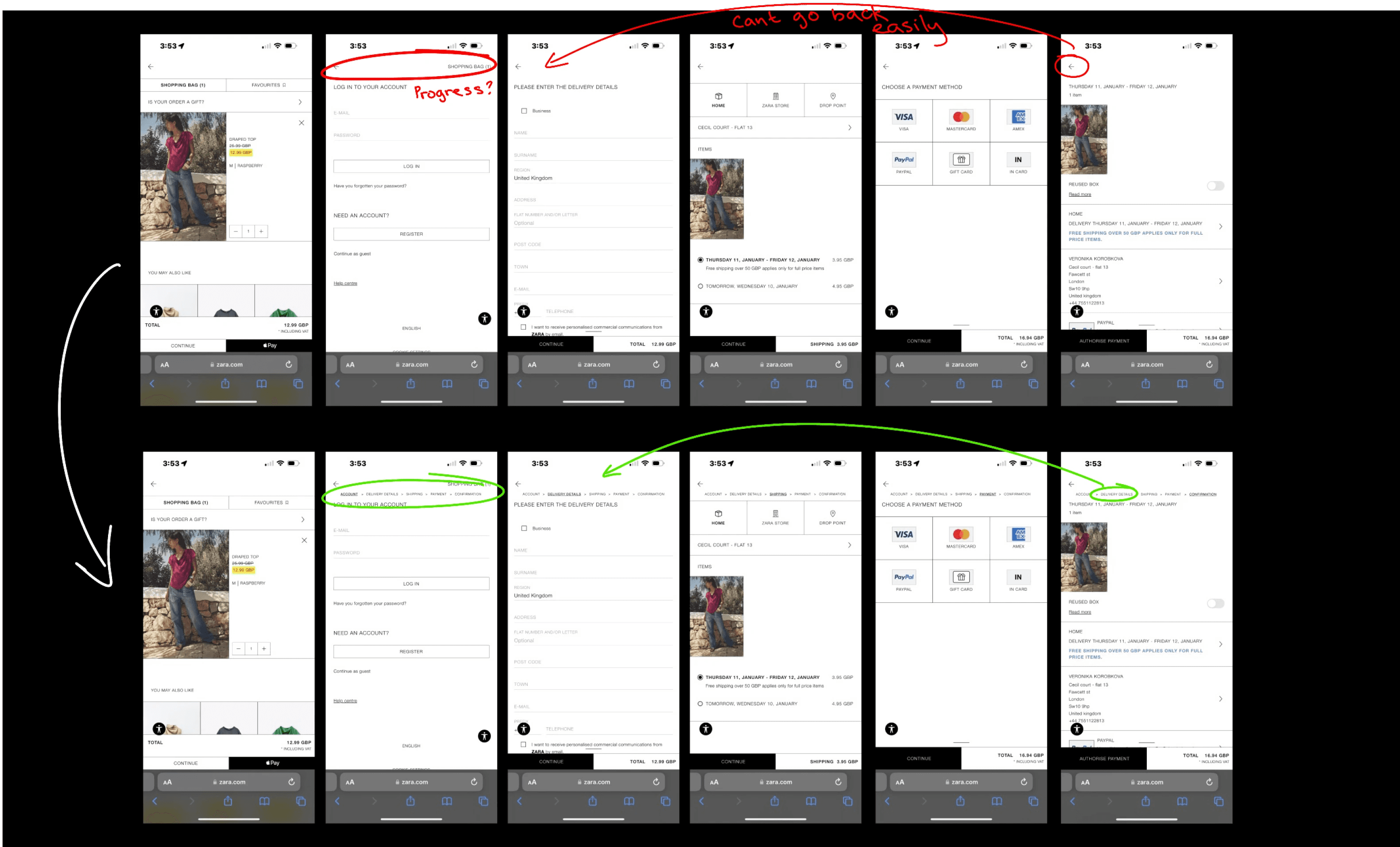
Checking out pages
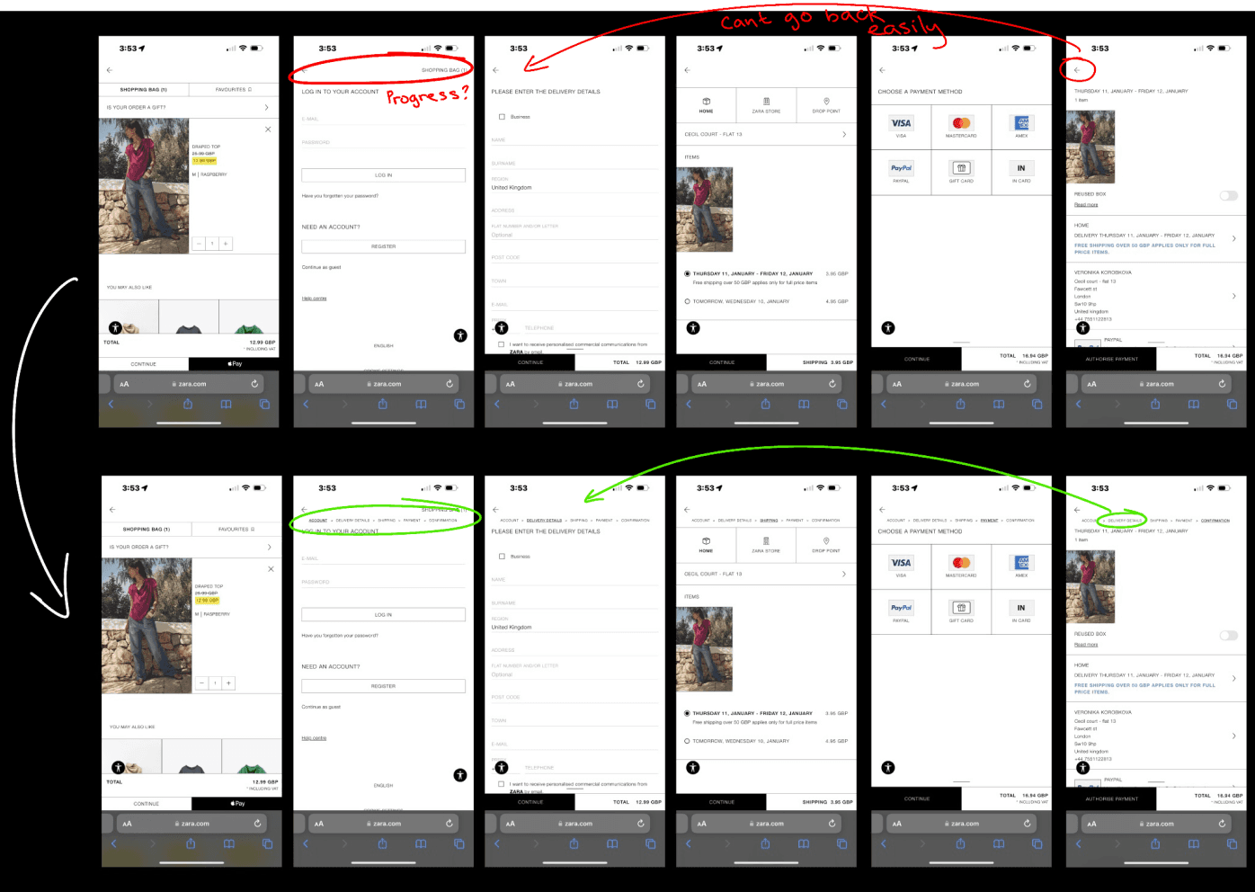
No progress indicator
To go back to a desired page you have to click the back arrow multiple times
User cant tell how far long in the process they are
Targeted heuristics: User control and freedom & Visibility of system status

Recommended design improvements
I have identified some of the more critical issues and here are my suggested design enhancements for those problems. Next, I will start addressing these issues in Figma to create a tangible example of how I plan to implement improvements to resolve their current problems.
Next steps
If I had additional time to dedicate to this project, my subsequent steps would involve implementing the remaining proposed design improvements. Following that, I would proceed with conducting user testing to determine if my proposed designs are well-received by users and effectively address the current issues.


For one of my projects, I was tasked with learning and applying heuristic evaluation to a website of my choosing within a one week timeframe.
Heuristic evaluation involves examining a user interface to assess its adherence to established usability guidelines, termed heuristics.
Jakob Nielsen's 10 fundamental usability heuristics are widely recognised guidelines for interface design, aimed at improving user experience.
The 10 heuristics are:
Visibility of System Status
The system should always keep users informed about what is going on, through appropriate feedback within reasonable time.
Match Between System and the Real World
The system should speak the users' language, with words, phrases, and concepts familiar to the user, rather than system-oriented terms. Follow real-world conventions, making information appear in a natural and logical order.
User Control and Freedom
Users often choose system functions by mistake and will need a clearly marked "emergency exit" to leave the unwanted state without having to go through an extended dialogue. Support undo and redo.
Consistency and Standards
Users should not have to wonder whether different words, situations, or actions mean the same thing. Follow platform conventions.
Error Prevention
Even better than good error messages is a careful design which prevents a problem from occurring in the first place. Either eliminate error-prone conditions or check for them and present users with a confirmation option before they commit to the action.
Recognition Rather Than Recall
Minimise the user's memory load by making objects, actions, and options visible. The user should not have to remember information from one part of the dialogue to another. Instructions for use of the system should be visible or easily retrievable whenever appropriate.
Flexibility and Efficiency of Use
Accelerators—unseen by the novice user—may often speed up the interaction for the expert user such that the system can cater to both inexperienced and experienced users. Allow users to tailor frequent actions.
Aesthetic and Minimalist Design
Dialogues should not contain information which is irrelevant or rarely needed. Every extra unit of information in a dialogue competes with the relevant units of information and diminishes their relative visibility.
Help Users Recognise, Diagnose, and Recover from Errors
Error messages should be expressed in plain language (no codes), precisely indicate the problem, and constructively suggest a solution.
Help and Documentation
Even though it is better if the system can be used without documentation, it may be necessary to provide help and documentation. Any such information should be easy to search, focused on the user's task, list concrete steps to be taken, and not be too large.
Choosing a website
I've decided to focus on the Zara website for my Unit 4 project. As a regular Zara shopper, I've often found myself feeling frustrated with their website.
To ensure that my perspective isn't biased, I conducted some research and discovered that Zara's website has a low rating of 1.2 out of 5 stars on Trustpilot, accompanied by numerous user complaints labelling it as one of the worst websites they've encountered.
Given the tight timeframe and the challenge of completing a 2-week group project solo within just 5 days, I was unable to conduct user testing or engage in primary research.


Usability heuristics:
selecting a specific task flow
I intend to assess the Zara website using Jakob Nielsen’s 10 fundamental usability heuristics, aiming to thoroughly investigate its shortcomings.
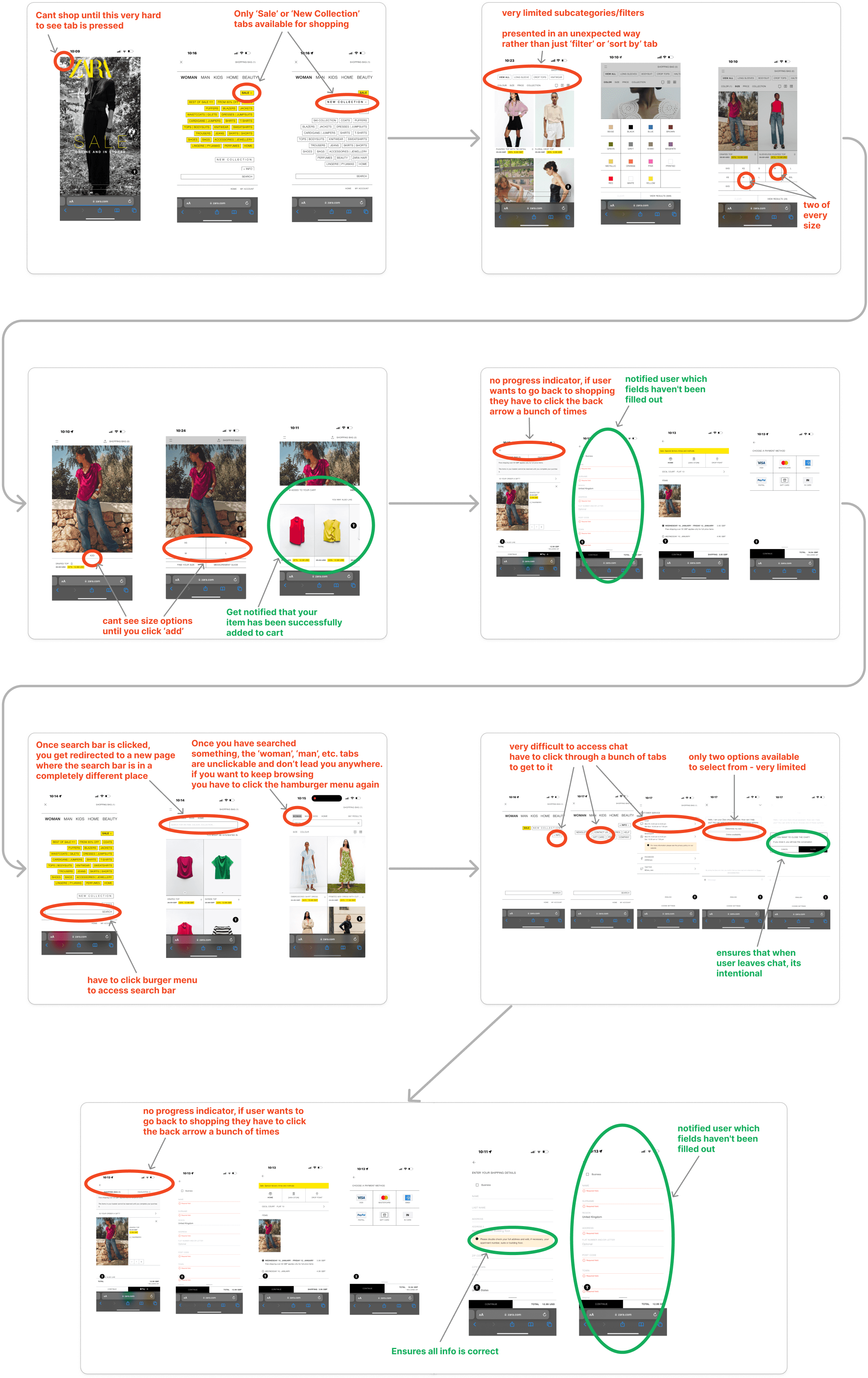
Firstly, I have established a task flow demonstrating what a typical user may do on the Zara website (browse, look up item, add to cart, open live chat) in order to evaluate its compliance with these usability principles.

Current website task flow demo
Here I am showcasing the present user experience on the Zara website and highlighting any issues users might face while navigating their site.
Chosen heuristics
I have categorised the problems I encountered on the Zara website into heuristics and below I will present the following issues.

Visibility of system status
The design should always keep users informed about what is going on, through appropriate feedback within a reasonable time.
No clear call to action button on the home page
Leaves users unsure about what action to take, especially with primary and secondary navigation being hidden behind the very subtle hamburger menu
Hamburger menu hides primary and secondary navigation
Plenty of confusing interaction
No progress indicator when in shopping cart
Hard to see the actual product in the imagery
No shopping cart logo


User control and freedom
Users often perform actions by mistake. They need a clearly marked "emergency exit" to leave the unwanted state without having to go through an extended process.
If item is added to cart accidentally, no easy direct way of removing it through the pop up screen
Cant change size of item without removing it from cart and adding it again from scratch
When searching up a specific item, the ‘woman’, ‘man’, etc. tabs don’t lead you anywhere
When browsing there are only ‘sale’ or ‘new collection’ tabs

Consistency and standards
Users should not have to wonder whether different words, situations, or actions mean the same thing. Follow platform and industry conventions.
Product images are inconsistent
Vertical scrolling through images instead of horizontal
Inconsistent imagery makes sizing unreliable for users as products are demonstrated in a bizarre way


Error prevention
Design the system so that users cannot make serious errors, or at least make it easy to detect and correct them.
Size isn’t visible prior to ‘add’ button
Two of every size is presented when trying to filter items, only one of them is functioning - the other will lead to ‘no results’
‘close’ and ‘cancel’ buttons when closing chat can be confusing

Help and documentation
It’s best if the system doesn’t need any additional explanation. Any such information should be easy to search, focused on the user's task, concise, and list concrete steps to be followed.
There are no navigation buttons or icons to assist users in returning to browsing.
The only option available for users to go back to the homepage is the ZARA word mark.
No progress indicator - difficult to return to desired page
No ‘add to cart’ option prior to clicking on individual item
Lack of hierarchy of information on tabs and filters
Chat button is very difficult to access

Usability issues
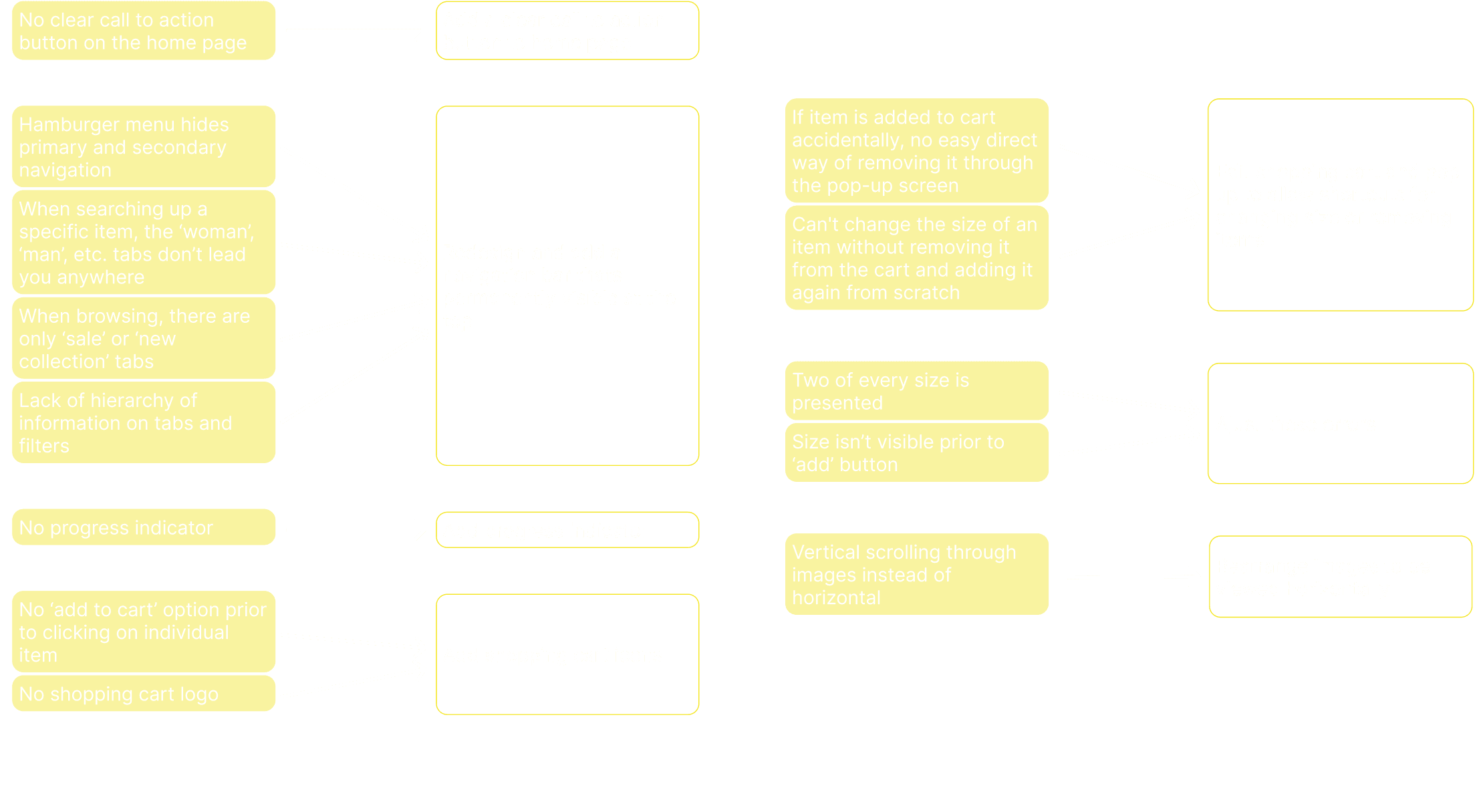
I have organised the identified issues from most to least severe to assist in prioritising which problems to address first and to construct a design prioritisation matrix.
Hamburger menu hides primary and secondary navigation:
No progress indicator - difficult to return to desired page
Plenty of confusing interaction
Inconsistent imagery makes sizing unreliable for users as products are demonstrated in a bizarre way
No clear call to action button on the home page
There are no navigation buttons or icons to assist users in returning to browsing
When searching up a specific item, the ‘woman’, ‘man’, etc. tabs don’t lead you anywhere
Lack of hierarchy of information on tabs and filters
No ‘add to cart’ option prior to clicking on individual item
Two of every size is presented when trying to filter items, only one of them is functioning - the other will lead to ‘no results’:
Size isn’t visible prior to ‘add’ button
Can't change the size of an item without removing it from the cart and adding it again from scratch
If item is added to cart accidentally, no easy direct way of removing it through the pop-up screen
Vertical scrolling through images instead of horizontal
When browsing, there are only ‘sale’ or ‘new collection’ tabs
Chat button is very difficult to access
‘Close’ and ‘cancel’ buttons when closing chat can be confusing
No shopping cart logo
Most severe
Mid
Least severe
Design prioritisation matrix
I have developed a design prioritisation matrix that aids in determining which issues to address first. This step is crucial, particularly when operating under a tight schedule.

Recommended design improvements
I have identified some of the more critical issues and here are my suggested design enhancements for those problems. Next, I will start addressing these issues in Figma to create a tangible example of how I plan to implement improvements to resolve their current problems.
Updated designs
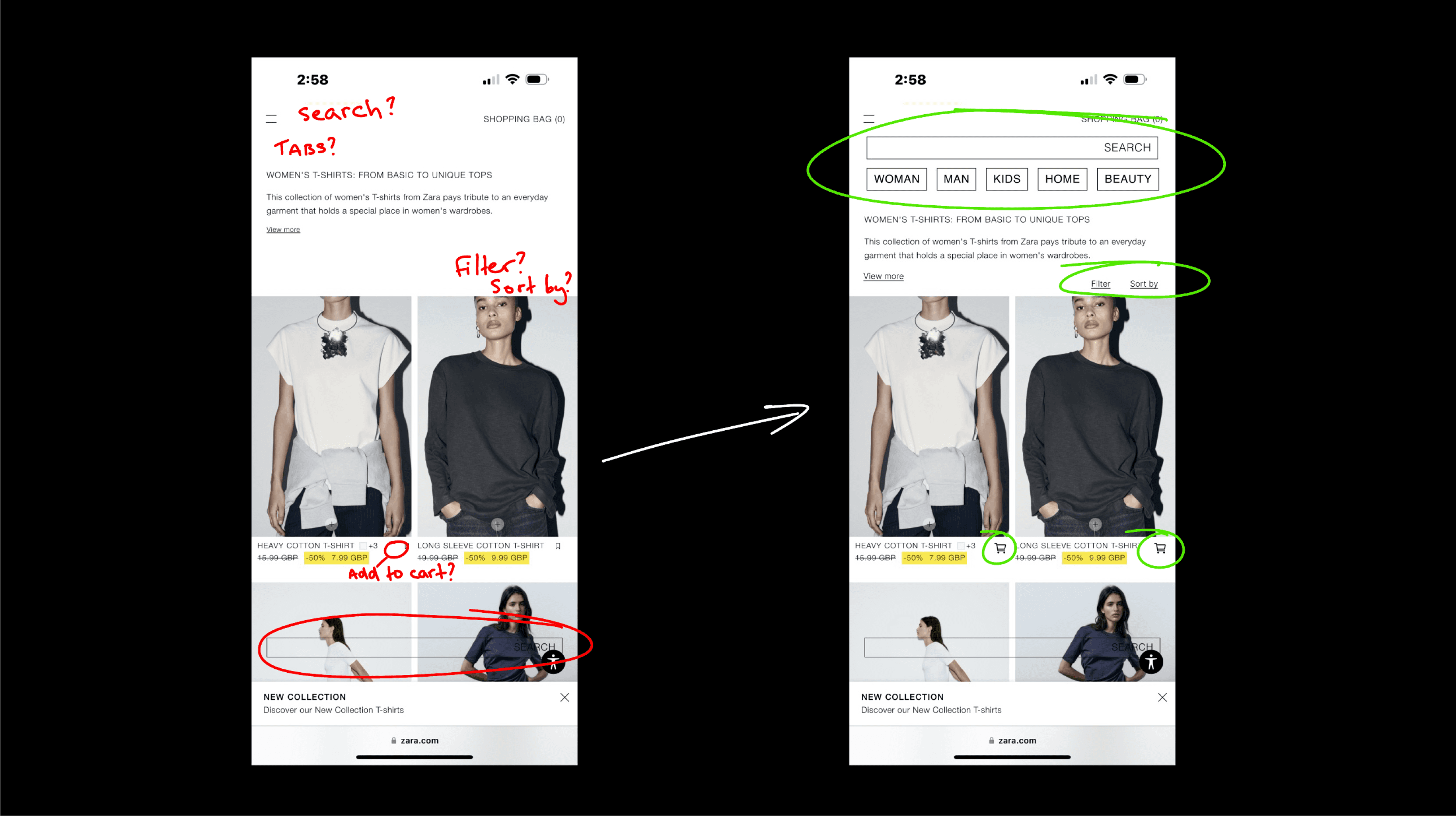
Here, I am presenting a comparison of the original website and my proposed improvements, showcasing the before and after.
Home page
No call to action button
Hamburger menu is hard to see
Hamburger menu hides primary and secondary navigation
Targeted heuristics: visibility of system status

Browsing page
No immediate add to cart
Search bar is at the bottom and hard to see
No navigation bar/tabs
No Filter/Sort by
Targeted heuristics: Visibility of system status & Help and documentation
Hamburger menu
‘WOMAN’ ‘MAN’ tabs aren’t clickable
Only ‘SALE’ or ‘NEW COLLECTION’ tabs
Hard to find contact option
Targeted heuristics: Visibility of system status & User control and freedom

Item page
Inconsistent imagery shown first
Vertical swipe instead of the expected horizontal
No go back button (browser nav bar disappears)
No size shown prior to clicking ‘ADD’
Targeted heuristics: Visibility of system status, Error prevention, Consistency and standards & Help and documentation
Adding to cart
No size shown prior to clicking ‘ADD’
Two of each size is shown when trying to filter by size
Only one of those two size option leads to desired outcome, other leads to ‘no results’
No go back button
Targeted heuristics: Error prevention & Help and documentation
Adding to cart pop up
Once added to cart you cant edit or remove item without going to cart, deleting item and re-adding it again in the correct size
Targeted heuristics: User control and freedom & Help and documentation

Checking out pages
No progress indicator
To go back to a desired page you have to click the back arrow multiple times
User cant tell how far long in the process they are
Targeted heuristics: User control and freedom & Visibility of system status
Recommended design improvements
I have identified some of the more critical issues and here are my suggested design enhancements for those problems. Next, I will start addressing these issues in Figma to create a tangible example of how I plan to implement improvements to resolve their current problems.
Next steps
If I had additional time to dedicate to this project, my subsequent steps would involve implementing the remaining proposed design improvements. Following that, I would proceed with conducting user testing to determine if my proposed designs are well-received by users and effectively address the current issues.
Get in touch:
07551122813
veronika.korobkova@gmail.com
